


-
Tell a friend
-
What's going on Mean Green?
-
0
New Seat Selection
Has anyone received a call yet about their new seats? Were you able to be close to your original spot? I got an email today that I’ll be receiving a call tomorrow. I'm just not sure what to expect. -
8
-
7
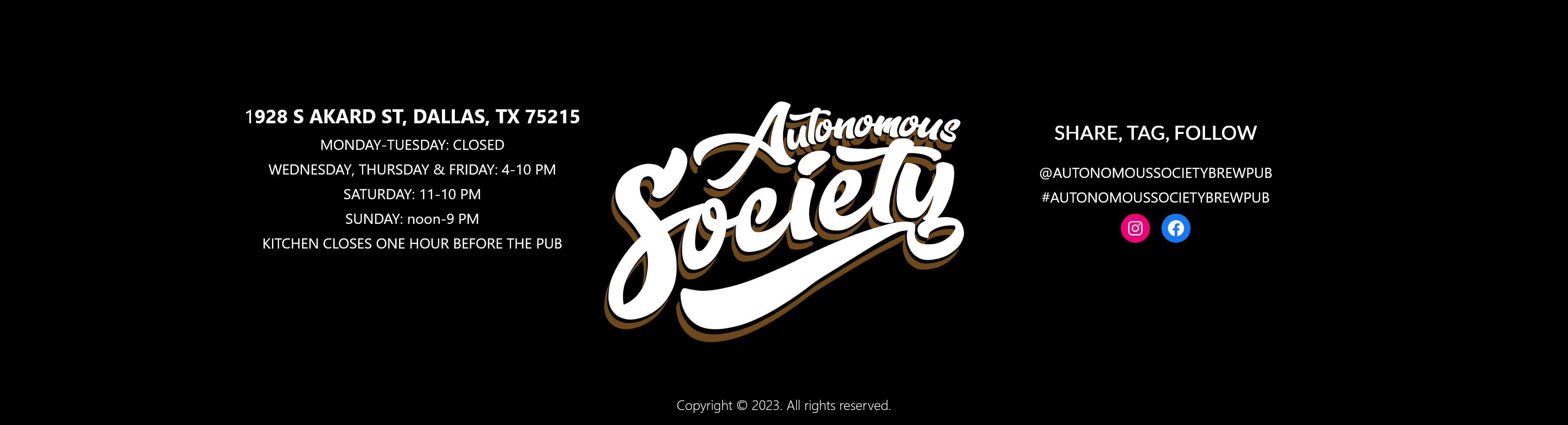
New TP WR (5/16/2024)
Unless he was told he no longer had a spot at Tulsa. I think it's been said before but aren't scholarships on a yearly basis now? -
0
Group of Five Coaches Ranked - CBS Sports
https://www.cbssports.com/college-football/news/ranking-every-coach-in-the-group-of-five-heading-into-the-2024-college-football-season/ -
1
Lots Of Track Qualifiers (NCAA Regionals)
https://theamerican.org/tournaments/?id=301
-
-
Popular Contributors
-
1

-
2

-
3
-
4

-
5
-
-
Member Statistics
-

.jpg.2c34139d28f511fc91b929fa21c6b081.thumb.jpg.34e326535d3dc1a502adf551cec2bd5a.jpg)


Recommended Posts
Join the conversation
You can post now and register later. If you have an account, sign in now to post with your account.
Note: Your post will require moderator approval before it will be visible.