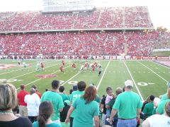
Jump to content

New North Texas Uniforms Facebook


All About UNT

Recommended Posts

Let's face it, Alabama has been extremely successful the last few years with those new age uniforms. Oh, and the comment about new uni's = new merchandise = more money. Umm, we still can't get merchandise for our two year old uniforms.

Surely you're not comparing one of the greatest and most historical program in college football history to North Texas are you?

Link to comment
Share on other sites

Surely you're not comparing one of the greatest and most historical program in college football history to North Texas are you?

I don't think anyone is doing that, however, isn't it smart to look at successful programs and think maybe they are on to something? Shit, slap Mean Green on the helmet. Ole Miss isn't the name of that school, right? People want a distinctive brand that will endure. I believe we are the only Mean Green. Edited by UNTexas
  • Upvote 2
Link to comment
Share on other sites

As much as I love the interlocking NT for the helmet, I thought there was a reason NT couldn't use it. Some kind of licensing problem?

The only issue I've ever heard of is that the NT Exes/Alumni Association holds the rights to the particular interlocking NT below. However, I doubt that the A.D. has ever even asked permission to use it, because I am sure there would be a workable solution.

time_1989bg.jpg

  • Upvote 1
  • Downvote 1
Link to comment
Share on other sites

As much as I love the interlocking NT for the helmet, I thought there was a reason NT couldn't use it. Some kind of licensing problem?

The main reason is it's not one of the approved logos/word marks, so it will never be seen on any licensed university apparel. The Lettermen's Association uses a variation of the (above) interlocked NT logo. Since that organization is something similar to the UNTAA I think they are free to do whatever they please in terms of logo selection so long as they get permission from owners of a logo or create one of their own.

TLCJSMFCLTICFAO.20080108135450.jpg

Edited by UNTFan23
  • Upvote 2
Link to comment
Share on other sites

I just don't see the difference in recruiting.

We're all going to believe what we want to believe. I can't be convinced that a 25-person class's "caliber" is going to be elevated enough by new unis to equate to 2 or 3 additional wins.

If we get a "golden egg" kid that signs because of new unis, I'll be very happy for whatever wins come our way, but that does not justify changing uniforms every 2 - 4 years. In my mind it doesn't seem like a solid enough return-on-investment given our current budget.

We got new unis with the Dodge hire, but I think the caliber of recruit was raised (if at all) because of the complete picture: commitment to getting a stadium, commitment to winning by getting rid of the old regime, etc. Unfortunately, for reasons that have been discussed, that class didn't work out.

Here we are now: another staff, the stadium in place. And a couple of losing seasons later. So some people want to think the new unis could elevate this significantly. Okay, no one used the word "significantly", but y'all think they are worth the spending.

I just want our Jimmies and Joes to win with what we got, and establish some kind of culture/branding identity that we can stick with it. I think there is long term value in that: bringing generations together based on similar colors, logos, etc.

Can we take this interesting uni debate in a new direction: money for new unis vs. money for new bball coach. Discuss.

Edited by greenminer
Link to comment
Share on other sites

Flashy uniforms and immaculate facilities have become so important in the dogged world of recruiting that Arizona State coach Dennis Erickson said if it sells to top recruits then his program is going to do what it takes to stay competitive.

"Life has changed, hasn't it?" Erickson said. "Facilities, uniforms, young people make decisions on that, that's just how it is. In saying that, it's different than it used to be but that's how it is and you deal with the times and go on and do whatever you do to get the football players you need to be successful."

"I committed there because of the university and the atmosphere and the uniforms are a plus," Brigham said. "That's more of an afterthought. That wouldn't be one of the top reasons to choose that university but now that I have chosen them and they're doing this whole new line of uniforms, I think it's great."

Treggs said: "I'm pretty sure every kid cares. Everybody wants the top-of-the-line equipment and the best-looking uniforms."

http://footballrecruiting.rivals.com/content.asp?CID=1265545

Edited by Mean Green 93-98
Link to comment
Share on other sites

anyone that thinks that our current uniforms have a "traditional" college look...are really are out of touch...

horn stripes on pants and your schools name spelled out on the helmet are not classic traditional college looks...it's terrible...not traditional!

Here's an idea...we could just borrow from our friends at the University of North Carolina...they seem to have a handle on branding and merchandising their school.

1) where they use interlocked NC we use NT

2) where they use North Carolina spelled out we use North Texas spelled out

3) where they use "TAR HEELS" spelled out we use "MEAN GREEN" spelled out

4) where they use "UNC" we use "UNT"

5) where they use tar heel "foot logo" we use "mean green" logo

6) where they use "ram" mascot we use "eagle" mascot

7) where they use 2 shades of blue..."baby blue and navy blue" we use 2 shades of green...say.. "kelly green and apple green"...we are the mean green...right...it would be ok for us to use more green combinations.

http://www.goheels.com/SportSelect.dbml?SITE=UNC&DB_OEM_ID=3350&SPID=12962&SPSID=667864

btw...the black accents are inspired from our friends down in Fort Worth...they have made some noise the last 10+years...copying great ideas is not a bad concept...we could learn a little something from the likes of North Carolina, TCU & Boise

Edited by 3XL
  • Upvote 1
Link to comment
Share on other sites

some of us need to pull our heads out of the sand and read a little book called "Who Moved the Cheese"...

because guess what...the "cheese has moved"

OldGuyStudent..."you named yourself not us"

Link to comment
Share on other sites

I don't think anyone is doing that, however, isn't it smart to look at successful programs and think maybe they are on to something? Shit, slap Mean Green on the helmet. Ole Miss isn't the name of that school, right? People want a distinctive brand that will endure. I believe we are the only Mean Green.

This and the UNC post that I didn't quote. Great posts. Losing would be a tad more fun if we at least looked good doing it. Aside from that we all get comments from friends about how cool the nickname is right? I see no good reason for not putting it on the helmet.

smh.

  • Upvote 1
Link to comment
Share on other sites

Prospects are all different so uniforms can matter a great deal or not at all. Some go to school for certain majors, some go because everyone in their family has gone there, some commit early, some switch on National Signing Day and some kids love Penn State's old-school uniforms that haven't seen significant change in half-a-century.

But some like - make that, really like - the flashy trends.

and

Jeff Lockie, an Oregon quarterback commit, doesn't seem to care at all about uniforms and said they played no factor in his decision. At the school with NIKE money running deep through it, Lockie was not at all influenced by the fashion behind college football.

"As much as people say it does matter I have to say it did not matter to me," Lockie said. "It's a decision I'm making for the next four or five years of my life, I'm not going to pick a place because of the way they look on game day.

"Every school has nice uniforms and some are better than others, but you want to go to a place where you're OK with the coaches and the place you are and the people around you, not so much what jersey you're wearing."

and

As much as Brigham loved Maryland's unconventional uniforms, they played absolutely no role in his decision. He had committed months before they were unveiled so, like Petersen said, it's difficult to judge just how much influence the new, flashy uniforms play in the recruiting process.

"I committed there because of the university and the atmosphere and the uniforms are a plus," Brigham said. "That's more of an afterthought. That wouldn't be one of the top reasons to choose that university but now that I have chosen them and they're doing this whole new line of uniforms, I think it's great."

The above quotes just show that it isn't important to some, just as the article points out that it is important to some. Personally, I would prefer student athletes that are mature enough to base their decision on something other than uniforms.

I am not against options, but some of these are plain ridiculous. Plus, I think the article tries to make sell the idea that uniforms make a big differences, but the quotes above and the quotes from coaches stating that some kids like the options, Nike, Under Armour, Addidas, etc... while others don't clearly makes the point that it is purely a guessing game and in the end it is a wash. It will sway some recruits and others won't care.

Edited by UNTLifer
  • Upvote 2
Link to comment
Share on other sites

The above quotes just show that it isn't important to some, just as the article points out that it is important to some. Personally, I would prefer student athletes that are mature enough to base their decision on something other than uniforms.

I am not against options, but some of these are plain ridiculous. Plus, I think the article tries to make sell the idea that uniforms make a big differences, but the quotes above and the quotes from coaches stating that some kids like the options, Nike, Under Armour, Addidas, etc... while others don't clearly makes the point that it is purely a guessing game and in the end it is a wash. It will sway some recruits and others won't care.

All of the quotes indicate that uniforms are at least a factor. I wouldn't think it would be close to the main selling point, but it is on recruits' checklists. And I don't know why we wouldn't consider that. If your viewpoint is, "Let's have the ugliest and most embarrassing uniforms we possibly can to ensure our student-athletes base their decision on something other than uniforms," we're probably going to have a hard time finding common ground on this subject.

  • Upvote 2
Link to comment
Share on other sites

We need an updated look that both appeals to our fan base and our young recruits.

One way to do this is to start with the "helmet".

The basic helmet logo needs to be somewhat consistent...gone are the fifty shades of green & varity of screaming chickens (i.e. see our 1994 version) good god almighty! Simply use a collegiate interlocked NT....the green could be tweaked over time, the face mask could go black, green, white or grey...depending on what is the current trend...but our helmet logo should be the interlocked NT...this would serve us well for many years into the future.

Reasoning for the "Letterman's Association" interlocking NT

1. It's a classic collegiate look. (i.e. UNC or NC, Auburn, Notre Dame "ND", Texas Tech, Georgia Tech, Oklahoma, West Virginia, Kentucky, Virginia Tech, Baylor, Colorado, Houston, Indiana, USC or Southern California using interlocking SC on v-neck of jerseys) "we should not put UNT on everything. Texas does not put UT on a baseball hat. North Carolina does not put UNC on a baseball hat"

2. "If we want to be a little bigger...we need a bigger mark"...less of the UNT,FIU, FAU, WKU, UAB, UCF, ECU etc...

3. No other University has the interlocking NT

4. NT is perfectly balanced and symmetrical...makes a great brand or mark for: car emblems, jackets, caps, hats, flags, jewelry, suit pens, cuff links, gameday logo belts, tailgate tents & games, golf balls & ball markers, cups, coozies, mugs, shirts, etc...

5. We used to have it on helmet back in the Mean Joe Green days. "it ties the old with the new"

6. the NT scale & size for this new proposed helmet design was inspired by Texas A&M's "T"

7. there are lots of eagles flying around but no "NT" or "Mean Green"

8. think North Carolina in green

9. this is not a rebrand but our school needs to seriously consider adding the interlocked NT as an additional mark...this will increase mercandising sales.

Reason for the "Green with Black Accents"

1. They look great together.

2. It's current and looks less 1970's and 1980's...white shoes & socks, horn stripe pants..."come on man" our team deserves better

3. NT already uses black accents in our other sports uniforms and black is on our football field

4. Our friends in Fort Worth have mastered the art of marketing "black" to their fans base. The TCU players love it!

Reason for State of Texas stamp on the under shirt

1. Tastefully eliminates the need to "spell out" North Texas on the helmet.

2. Would need to keep it simple and green...no numbers, logos, words, outline, stars, bars and for sure no SOW.

recently...I saw a Houston fan wearing a black Nike jacket with their interlocked UH in red on the chest...it was terrific looking! Once again, I had to hang my head, swallow sadness and continue to be frustrated by zero choices of "cool looking" North Texas apparel. It's mind numbing how awful our apparel choices are.

  • Upvote 4
  • Downvote 2
Link to comment
Share on other sites

Would you be okay with those uniforms and a SOW helmet?

Actually, I would.

Interlocked letters are done by practically everyone and when we're trying to stand out from everyone else, the last thing we need is to look the same. The SoW may be an eagle like for the other schools that use one, but ours looks different from theirs, by far. It also avoids the "TN? Texas Northern?" issue pretty quickly.

I don't think anyone wants "North Texas" on the helmets.

Link to comment
Share on other sites

I remember when Astros fans clamored for a black jersey. They got rid of it because they're brutally hot. Black is terrible. And if you do black pants, you look like the Ravens (leggings). Green and white are our colors. Stick with them. Flywire our jerseys, put a stripe down the legs and put a matte white SOW towards the facemask of a matte green helmet. I don't get why people like these jerseys, they're the most unprofessional crap I've seen in a while. Looks like a PS novice whipped them up in 20 minutes. We don't have cool apparel? I'd tend to disagree. Nike brought us tons of sweet stuff. The NT interlock is cliche and overdone.

  • Upvote 3
  • Downvote 3
Link to comment
Share on other sites

I remember when Astros fans clamored for a black jersey. They got rid of it because they're brutally hot. Black is terrible. And if you do black pants, you look like the Ravens (leggings). Green and white are our colors. Stick with them. Flywire our jerseys, put a stripe down the legs and put a matte white SOW towards the facemask of a matte green helmet. I don't get why people like these jerseys, they're the most unprofessional crap I've seen in a while. Looks like a PS novice whipped them up in 20 minutes. We don't have cool apparel? I'd tend to disagree. Nike brought us tons of sweet stuff. The NT interlock is cliche and overdone.

fyi...the Black Unis are just an 3rd option for fun....my personal favorites are the "all Green home" and "all White aways"...if you read it...it states (Black Accents)...accents are cuffs, collars, shoes, socks, chin straps, face mask & letter or number outlines. I love our Green.

I did the math and concluded that....the Screaming Chicken on anything is < NT and does not = sweet stuff.

Link to comment
Share on other sites

fyi...the Black Unis are just an 3rd option for fun....my personal favorites are the "all Green home" and "all White aways"...if you read it...it states (Black Accents)...accents are cuffs, collars, shoes, socks, chin straps, face mask & letter or number outlines. I love our Green.

I did the math and concluded that....the Screaming Chicken on anything is < NT and does not = sweet stuff.

So let me get this straight:

You're saying the current logo (what we call the 'Son of Worm') is not 'sweet'? What is it?

I happen to like it better than "North Texas", or an interlocked "NT".

  • Upvote 2
Link to comment
Share on other sites

Join the conversation

You can post now and register later. If you have an account, sign in now to post with your account.
Note: Your post will require moderator approval before it will be visible.

Guest
Reply to this topic...

×   Pasted as rich text.   Paste as plain text instead

  Only 75 emoji are allowed.

×   Your link has been automatically embedded.   Display as a link instead

×   Your previous content has been restored.   Clear editor

×   You cannot paste images directly. Upload or insert images from URL.


×
×
  • Create New...

Important Information

We have placed cookies on your device to help make this website better. You can adjust your cookie settings, otherwise we'll assume you're okay to continue. Please review our full Privacy Policy before using our site.