Jump to content

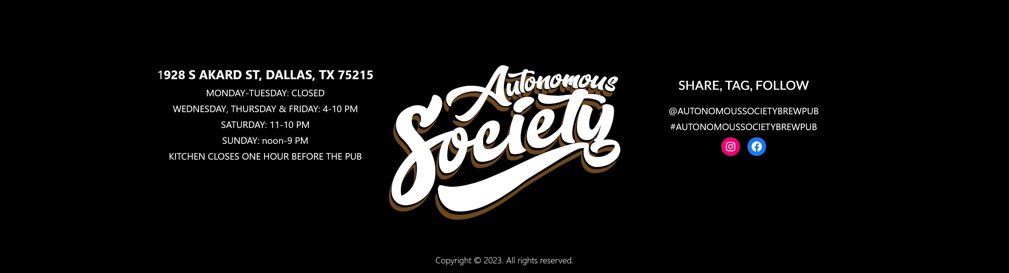
Chances for new uniforms in the 2014 season?


MeanGreen55

Recommended Posts

i like our uniforms. i would just want to have a White SOW on the green helmets and a white helmet with the green SOW. everything else we have is good just how it is!!! black uni with the black carbon fiber helmet is dope! (unfortunately, the SOW doesnt match the green on the uniforms, but i got over it)

Link to comment
Share on other sites

The uni floating around on somewhere on this board is legit. The green interlocked NT with black and green uni is what it was I believe. Looks very sharp. The current home uni has to go though. The green on the bubble lettered north texas helmet looks like the equipment manager takes all the home helmets, jerseys, and pants out to west Texas during the offseason. He then finds a nice open field and puts then on a clothes line for the next 7 months and lets them fade out to this green that makes my eyes bleed.

  • Upvote 3
  • Downvote 2
Link to comment
Share on other sites

The uni floating around on somewhere on this board is legit. The green interlocked NT with black and green uni is what it was I believe. Looks very sharp. The current home uni has to go though. The green on the bubble lettered north texas helmet looks like the equipment manager takes all the home helmets, jerseys, and pants out to west Texas during the offseason. He then finds a nice open field and puts then on a clothes line for the next 7 months and lets them fade out to this green that makes my eyes bleed.

The one "floated around here" is a weird mockup that the AD took and made look professional for our black uniforms.

We need a mean looking but traditional all green Pro Combat jersey with different shades of green. If high schools have Pro Combat, no excuse we don't.

Feel like the SOW is on the helmet 100% though.

But realistically, I think uniforms stay the same with a SOW helmet. I just hate that ugly stripe thing on the pants. Looks terrible. Traditional unis with that weird design...makes no sense.

Edited by meangreener
  • Downvote 6
Link to comment
Share on other sites

The uni floating around on somewhere on this board is legit. The green interlocked NT with black and green uni is what it was I believe. Looks very sharp.

Ben Gooding - pay no mind to MeanGreener he's special and our very own "professor of meatheadism." As far as his design ideas? we're still waiting....

Edited by 3XL
  • Upvote 1
  • Downvote 3
Link to comment
Share on other sites

I really like the look of the black and green. It would also be sharp to take that same uniform and make the black area green and the green area white... Do this on both the jersey and pants. Then take that "green" one and reverse the colors again for our "white" uniforms. As far as the helmet. Are we a big enough time school yet to have two? Could we have green helmet with the black SOW like the one that debuted on Halloween, as well as the a black or Carbon Fiber one like from the Heart of Dallas Bowl?

  • Upvote 3
Link to comment
Share on other sites

I really like the look of the black and green. It would also be sharp to take that same uniform and make the black area green and the green area white... Do this on both the jersey and pants. Then take that "green" one and reverse the colors again for our "white" uniforms. As far as the helmet. Are we a big enough time school yet to have two? Could we have green helmet with the black SOW like the one that debuted on Halloween, as well as the a black or Carbon Fiber one like from the Heart of Dallas Bowl?

THIS.

  • Upvote 2
Link to comment
Share on other sites

Ben Gooding - pay no mind to MeanGreener he's special and our very own "professor of meatheadism." As far as his design ideas? we're still waiting....

So if you can't argue you just choose to insult? Any graphic designer, or hell, any person who has ever designed uniforms would describe your uniforms as busy. They don't adhere to branding either.

Let's start, shall we?

First off, the NT logo on the helmet is not licensed by the university thus cannot be used.

Secondly, the jerseys appear to look like Pro Combat but are not.

Thirdly, the North Texas writing across the chest is not our font and cannot be used.

The numbers would be extremely hard to see from the stands and would not appear as TV friendly due to their sharp edges and lack of cut corners or at least curvature.

The Texas on the sleeves is not part of our branding--so nope, can't use those either.

The color scheme is nice, as is the color idea and the basic structure but the rest is unrealistic, ugly and too busy.

So after you take out all the nonsense in your design you're left with the black uniforms. Which were clearly INSPIRED by the best parts of your design and left out all the awful parts.

So, stripping it to the core, looks like years later, you still pimp your jerseys and don't bother with the fact that the AD pretty much used them but made them realistic.

Because personally, I like the basic organization and design of your uniforms. The home, away and alternate are fine. You simply ruined it by making a cheap Oregon knock off that would make us look like Tech via the name, the ugly Texas patch, the generic NT alumni logo and the fonts. Everything else is fine. You don't accept criticism because a few people don't worship the uniform design you made.

Not even sure you're using Kelly Green.

Also, I don't have Illustrator, so I guess my hands are tied and not making up a better uniform. Sounds like one of those "YOU CANT CRITICIZE FOOTBALL IF YOU CANT PLAY" arguments to me.

Edited by meangreener
  • Upvote 2
  • Downvote 3
Link to comment
Share on other sites

Ben Gooding - pay no mind to MeanGreener he's special and our very own "professor of meatheadism." As far as his design ideas? we're still waiting....

this needs to be UNT's uniform mix!!!! Throw the SOW in there for HC, senior day, and/or bowl games. But this mix needs to happen!!!!!!!! These are clean and catches the eye of casual fans, recruits, and MGN will love these! MAKE IT HAPPEN!!!
  • Upvote 2
Link to comment
Share on other sites

this needs to be UNT's uniform mix!!!! Throw the SOW in there for HC, senior day, and/or bowl games. But this mix needs to happen!!!!!!!! These are clean and catches the eye of casual fans, recruits, and MGN will love these! MAKE IT HAPPEN!!!

They already did.

The black uniforms.

I mean, on that design, you can't even tell if it's a 35 or an 85.

Edited by meangreener
  • Upvote 2
  • Downvote 1
Link to comment
Share on other sites

I really like the look of the black and green. It would also be sharp to take that same uniform and make the black area green and the green area white... Do this on both the jersey and pants. Then take that "green" one and reverse the colors again for our "white" uniforms. As far as the helmet. Are we a big enough time school yet to have two? Could we have green helmet with the black SOW like the one that debuted on Halloween, as well as the a black or Carbon Fiber one like from the Heart of Dallas Bowl?

This is a great uniform idea.

  • Upvote 1
Link to comment
Share on other sites

Guest
This topic is now closed to further replies.


×
×
  • Create New...

Important Information

We have placed cookies on your device to help make this website better. You can adjust your cookie settings, otherwise we'll assume you're okay to continue. Please review our full Privacy Policy before using our site.