


-
Tell a friend
-
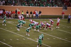
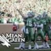
What's going on Mean Green?
-
-
7
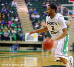
JUCO Target Bryson Smith
Looked at JJ's Eastfield stats for comparison and he averaged 18.9 ppg in 32 games, hit 20 points or more in 15 games, and scored a game-high of 45 against (Dallas) Richland College. Nothing against this guy as I've never seen him play but I hope this is a PWO. Would be great for him to come in and earn a scholarship like JJ did.- 1
-

-
34
Great Osobor transferring to Washington with big NIL deals ($2 million)
I agree with you. I would not vote an increase in student fee if I were a current student. I understand that student fees and institutional support are in theory necessary to break even. Doesn't change that it's hard to look at the system seriously when you look at coaching salaries, even at smaller programs. All in all, the biggest programs and networks are to blame. They'll ruin college athletics for good if they don't figure out a solution that benefits all parties at all levels. More important than our fandom is the athletic scholarships of thousands of male and female athletes outside the top 1% are at risk of being lost if schools eventually choose to drop football.- 1
-
-
24
Looks like the end for Sports Illustrated
Make Magazines Great Again -
34
Great Osobor transferring to Washington with big NIL deals ($2 million)
There is a substantial value now, but what when we are relegated back to the equivalent of FCS or I-AA? Will that value still be worth it? Perhaps in basketball but not sure if football makes sense. Just thinking out loud here.- 1
-
-
-
Popular Contributors
-
1
-
2

-
3

-
4
-
5
-
-
Member Statistics
-

.jpg.2c34139d28f511fc91b929fa21c6b081.thumb.jpg.34e326535d3dc1a502adf551cec2bd5a.jpg)


Recommended Posts
Join the conversation
You can post now and register later. If you have an account, sign in now to post with your account.
Note: Your post will require moderator approval before it will be visible.