


-
Tell a friend
-
What's going on Mean Green?
-
25
Texas Tech season tickets sold out this year
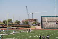
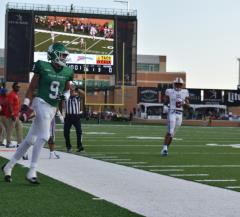
How many people in that photo even care that we have a football team?- 1
-

-
12
Why the NCAA model is dying and will be replaced
Times are changing with NIL and Portal. The players are being lured with $$. It may be time for hard contracts with buyouts to bind them to teams (schools), like NFL players. If a P5 wants them, then a buyout in the contract specifies what they owe the losing school. Same as with buying out a scheduled game. But there are more schools in FBS like us than not like us. It's a normal reaction to want to spend more funds on a successful sport, like basketball is right now at NT. At some schools basketball is terrible but the football is good, or baseball is good. ECU fans couldn't wait to be done with basketball because their baseball was ranked pre-season. But it's a chicken-egg thing. Why is our basketball now successful when it wasn't for many seasons with Benford and Trilli, even with good players? Better players, coaches? Yes to both. What is most important? Yes again to both. What needs to stay if one leaves. That would be the coach needs to stay. Coaching is the best investment a school can make....not money to players. -
18
-
7
2024 Coaching Caravan locales, dates and times announced
Will there be a Denton kickoff function this year? I don't think they called the Denton program a caravan stop last year so hoping they just haven't announced a date. GMG -
6
-
-
Popular Contributors
-
1

-
2
-
3

-
4
-
5

-
-
Member Statistics
-


Recommended Posts
Join the conversation
You can post now and register later. If you have an account, sign in now to post with your account.
Note: Your post will require moderator approval before it will be visible.