Jump to content

New Uta Logo And Mascot


LoveMG

Recommended Posts

My degree is in advertising art, but I just think it is so funny to read all the bs people say about branding and logo and color ambiance, etc. If the universities would spend the money they waste on these branding efforts on real educational endeavors we tax payers would be a lot better off. Graphic artists can be the biggest con artists sometimes and they really start to believe in all the bs they say.

Link to comment
Share on other sites

uuuuh, I think we could do the same comparison exercise with your screaming eagle and a few others, starting with the U.S. Post Office.

It's a shame the USPS copied us. :ph34r:

Thank goodness they, USPS, didn't change their colors to green and white!

Edited by UNTLifer
Link to comment
Share on other sites

Well, the way I look at it, you guys unmercilessly thrashed your own athletic logo to a bloody pulp when it was the topic of the day, so you don't need me to lend a hand in this area. ;)

I'll admit, I really like the new UTA athletic logo, but not every one agrees, including a couple of critics on our own board. However, I predict that the athletic logo will be widely embraced by the campus, just as the institutional branding campaign, with its logos, wordmarks, and slogan, etc., has been. Of course, everybody thinks they are an expert in this area. If the now iconic UT Austin longhorn image came out for the very first time today, the criticism would be huge...too flat, too monotone, etc. But, after awhile, there is no controversy, and people get used to it...it is what it is.

I don't care if the new athletic image is a cousin or brother of another logo of a school in the northwest corner of the U.S., thousands of miles from here. And, a nice thing, while of course the administration endorsed the result, this was an entirely student-driven process, led by Student Congress; no outside consulting firms or anything like that. The only check that was cut was for proper compensation to the student designer of the winning image. The process and complete leadership of the students is something to be proud of, I think. But, unless you pick an obscure image like an armadillo or horned frog, inadvertently or not, it's hard to be completely original with an animal logo in this day and age of branding, with all the now-recognized graphic principles.

Link to comment
Share on other sites

My degree is in advertising art, but I just think it is so funny to read all the bs people say about branding and logo and color ambiance, etc. If the universities would spend the money they waste on these branding efforts on real educational endeavors we tax payers would be a lot better off. Graphic artists can be the biggest con artists sometimes and they really start to believe in all the bs they say.

I think UTA got taken for a ride here. It looks like a quick sketch done on paper, scanned in, done in lineart and combined with Copperplate Gothic. The Boise State one looks like someone really finessed it, UTA's looks like it was thrown together.

Link to comment
Share on other sites

True. But, another way of looking at is that the U.S. Post Office logo is slightly more ubiquitious than Boise State's.

Just trying to be helpful. :D

Perhaps - but Boise State's logo is more relevant

I'm not happy about our logo but man - I'd be ticked if we ripped off some other college's logo.

Link to comment
Share on other sites

Well, if you insist on a college, here it is. Look familiar?

http://hearitlive.huntingdon.edu/

Nice Find!

I admit I like the new UTA Logo...I surely hope it does wonders for your schools identity. Actually there are mascots after mascots, logos after logos for every team, school etc that its not surprising to see copycats or things that closely resemble another logo. I surely dont think its a big deal.

Link to comment
Share on other sites

I like it and if I went to UTA I would dawn some new gear. I like the student involvement - what an concept!

Copying success is not the worst thing you can do. UTA - Boise St. Mean Green - Southlake Carroll.

GMG

Link to comment
Share on other sites

Nice Find!

I admit I like the new UTA Logo...I surely hope it does wonders for your schools identity. Actually there are mascots after mascots, logos after logos for every team, school etc that its not surprising to see copycats or things that closely resemble another logo. I surely dont think its a big deal.

Which is exactly what I'm getting at. Thank you, my man.

Link to comment
Share on other sites

Join the conversation

You can post now and register later. If you have an account, sign in now to post with your account.
Note: Your post will require moderator approval before it will be visible.

Guest
Reply to this topic...

×   Pasted as rich text.   Paste as plain text instead

  Only 75 emoji are allowed.

×   Your link has been automatically embedded.   Display as a link instead

×   Your previous content has been restored.   Clear editor

×   You cannot paste images directly. Upload or insert images from URL.


  • Tell a friend

    Love GoMeanGreen.com? Tell a friend!
  • What's going on Mean Green?

    1. 13

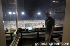
      Mean Green Invasion of Lubbock

    2. 2

      Roster?

    3. 6

      NBA Finals: Mavs vs. Boston

    4. 14

      Maniacs to extend their presence to football in 2024

    5. 3

      ESPN Football Power Index

  • Popular Contributors

  • Member Statistics

    • Total Members
      15,390
    • Most Online
      1,865

    Newest Member
    FairfieldFan
    Joined
×
×
  • Create New...

Important Information

We have placed cookies on your device to help make this website better. You can adjust your cookie settings, otherwise we'll assume you're okay to continue. Please review our full Privacy Policy before using our site.