


-
Tell a friend
-
What's going on Mean Green?
-
0
-
11
Any free agent signings?
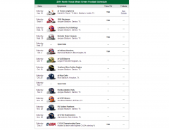
From CBSSports.com: 2024 NFL Draft picks by conference ·SEC -- 59 ·Pac-12 -- 43 ·Big Ten -- 42 ·ACC -- 41 ·Big 12 -- 31 ·Independent -- 8 ·Sun Belt -- 6 ·American -- 5 ·Conference USA -- 3 ·Mountain West -- 2 ·MAC -- 2 -
11
Any free agent signings?
But you didn't say I was wrong nor refuted the facts. Grow up.- 3
-

-
6
Tennis Advances @ the AAC Tournament
Have any of our players entered the transfer portal this year? Have we signed any recruits for next year? -
28
SFA stud guard Latrell Jossell commits to North Texas
Could be just that angle/picture.- 1
-
-
-
Popular Contributors
-
Member Statistics
-


Recommended Posts