


-
Tell a friend
-
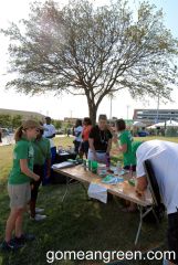
What's going on Mean Green?
-
18
Looks like the end for Sports Illustrated
It's horribly unfortunate that you have that situation, but there are probably better places than college forums to discuss the vices that are manifested from your "constant fear about what's between someone's legs". Brainwashing and mental manipulation by TikTok and other social media have reportedly been brutal to many other fragile and vulnerable teen girls in addition to yourself. There are legitimate recognized crisis support services that can offer therapy (many free) and can even defuse manifestations caused by programming to a hate induced woke ideology. We are a community here and hopefully posters can direct you towards helpful resources. God Bless and Best Wishes. -
4
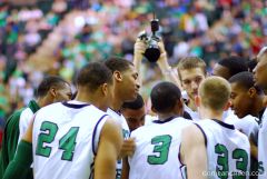
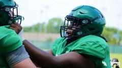
Early 2024 Football Record Prediction
A lot could change between now and Aug 31 but I think we’ll be 4-2 going into FAU game. -
4
Early 2024 Football Record Prediction
We will beat UTSA and I believe S Alabama -
4
Early 2024 Football Record Prediction
Why not? They were fair last year. I don't get some of these predictions. Maybe I'm the eternal optimist, but it is way, way, way too early. -
-
-
Popular Contributors
-
1
-
2

-
3

-
4
-
5
-
-
Member Statistics
-


Recommended Posts
Join the conversation
You can post now and register later. If you have an account, sign in now to post with your account.
Note: Your post will require moderator approval before it will be visible.