Jump to content

Helmet Design


Smitty

Recommended Posts

  • Replies 88
  • Created
  • Last Reply

Top Posters In This Topic

I like the Big eagle. The one of the "Michigan" Style looks good for a white or a Green helmet. The black trim is a nice touch. I would say that the big eagle should stay on a green helmet. Have you thought about a green helmet with a light gray or silver logo????

I tried gray and silver, but it just didn't work very well. At a light silver it becomes dingy, and any darker is too dark. Plus, I think UNT is going to want to stick with their color palette of green and white.

Link to comment
Share on other sites

I dont know if you already thought of this, but I think on the version with the big eagle, not the Wolverine style, the wings that come over the top of the helmet should connect. That might be a cool touch. Smitty, If you like, I am a bit of a uniform guru myself. I just cant transform my ideas onto paper or computer. Maybe we should combine our powers and submit some ideas to RV and TD.

Link to comment
Share on other sites

Excellent graphic work. I probably like the kelly green helmet color with white logo best. Also prefer the eagle body with head on the helmet, upper right with less wing length. The Michigan look is cool but not sure fans would know it's part of the current logo without the rest of it on there. Nice designs, please forward them to RV.

Link to comment
Share on other sites

OK Smitty, that is just too cool looking. I would have said "no way" if someone had described it, but that looks excellent. (The same style with the white background also looks excellent.)

It's Mean Green without being too Eagle-ish.

I like it because I know what logo it is a part of, but someone not knowing may think it's a little Cincy Bengal-ish looking? I'd like to see these designs on a real helmet, on a player on the field, to get a fan's look from a distance.

Link to comment
Share on other sites

Okay, really...

The diving eagle was the ONE good thing to come from all of this logo crap. There's no need to alter it, make it needlessly large, or rip-off the Philly Eagles or the Seahawks. Besides, the Michigan helmet was a take-off from the yellow stripes painted on the old leather helmets so the QB could spot his guys downfield.

Leave the eagle as is, find a good spot on the helmet so you can see the whole thing at a good distance. Doesn't matter which outline version makes it onto whatever color helmet, but don't mess with the eagle. It's good as is.

Wanna know how to judge how well a helmet design works? Show it to a non-UNT fan. Ask them what school it's for and ask them if they like it. Don't tell them who you are or what school you like, just let them look at the helmet and figure it out on their own.

Edited by meangreendork
Link to comment
Share on other sites

Besides, the Michigan helmet was a take-off from the yellow stripes painted on the old leather helmets so the QB could spot his guys downfield.

Not entirely. The stripes were the outside edges of the typical leather helmet made by most helmet manufacturers of that day. The "stripe" or rib was the ONLY surface of the helmet at that time. You either left the whole thing one color or you painted the ribs if you wanted to change up to the schools second color. When I get back up to the Exes offices I'll take a photo of one of our players in the annuals that shows NT players with the exact same thing but only in green and white. Many schools of that era had the exact same design as Michigan simply due to the way the helmet was made.

Rick

Link to comment
Share on other sites

Smitty:

I have to say, THANK GOD someone came up with something creative! This is the first design idea I can get on board with! Myself along with my old college roomie and UNT alum's. He's works as an Art director, and I work in Architecture, each of both graduated from School of Fine Arts. I cant tell you how many times each of us have cringed at the past helmet designs for UNT. We continually discuss coming up with thumbnails, sketches and the like, and see if we can somehow get them to University to consider. I say Kudos to this design Smitty, dont let this be a fantasy. YOU BURY everyone in the Athletic department's email with these!

I'm going to get on my soapbox here for insignia design for all those read and understand. To ME, this is EXTREMELY important. I think alot of people in the UNT family dont care for past designs, but can never seems to answer WHY they dont care for it. I think the reason is this. To me the previous designs have absolutely nothing "collegiate" about them. I was literally fit to be tied with UNT came out with the version that had "North Texas" in "brush script" font. Seriously, it PISSED me off. I read an article in the paper as to WHY they chose this design. It was stated by someone at UNT that they wanted something to clearly identify the team, very easily. Basically, it's almost as if someone thought to themselves "how could this team be recognized if you happened to turn the channel on TV to a game with UNT playing?" So they came up with this theory that if we make the helmet as a billboard, that would solve the problem. To make matters worse, BRUSH SCRIPT FONT?????????? The last time I saw that font was on T-shirt in the 1970's and it said "Im with stupid" or "Who Farted?" In short, I thought that design of helment was embarressing, at best. The entire concept and theory behind it was ridiculous. The only improvement they attempted to make was the fonts. A small improvement, but very little.

As for those fans that really want UNT to be recognized (and Im totally with you) you have to realize one main theory. CONSISTANCY. IF anyone at the unversity is reading this, listen up. A good design is key, but it will be the performance of the football program that GETS the insignia recognized over time. And any thing kept consistant over time will become "tradition" the very foundation college football thrives on. Let me give you a good example. Take a team like the Michagan Wolverinces. If you were to quiz college football fans and show them Michigan's helmet design, they would immediately recognize it. EVERYONE knows that helmet. And yet, if you asked they what is the history behind that design, I would wager that less than 10% would know the answer. (FYI, in case anyone is wondering, it dates back to the days of the old leather helmets. The individual pieces of leather had to be cut in odd shapes to allow the helmet to be round, much like a basketball. The players simply painted some of those leather pieces to create that design that still lives today). All they know is, "University of Michagan, damn good football teams for years". Are there any words on the Michigans helmet? No. Does there need to be UNT or North Texas on our helmets? Certainly not... Not saying it's a no no, just stating if you want your football team to be recognized, the first thing is have a good football team. The insignia should be consistant and will take care of itself if the team wins.

Smitty, thanks again for the work you put into those, very nice job. I apologize for using your post to shout at UNT about previous designs, but I've wanted to say something for a very long time. Its good to know someone has a good eye out there.

One Insignia, One Color, No Billboards, period...

Link to comment
Share on other sites

To me the previous designs have absolutely nothing "collegiate" about them.

I couldn't agree more, which is why the Letterman's Jacket version of the interlinked "NT" is my first choice.

letterjacket_250x174.jpg

(FYI, in case anyone is wondering, it dates back to the days of the old leather helmets. The individual pieces of leather had to be cut in odd shapes to allow the helmet to be round, much like a basketball. The players simply painted some of those leather pieces to create that design that still lives today)

As I posted earlier, there are numerous photos of North Texas teams with the same design for reasons stated above. I'll try and post a photo of one of them when I can.

Rick

Edited by FirefightnRick
Link to comment
Share on other sites

Well thanks for posting trud1966. All I want to know is where in the hell have people like you and Smitty been for the past 12 years! Amateurs like me, FirefightnRick and others have been trying to draw attention to helmet insignia for several years. This helmet design stuff comes up at least once a year and some of us do our best to come up with different options. But it's mere childs play compared to what Smitty came up with. And your comments are dead on target. But Christs sake, come out of your talented closet! Give NT some damn options on this stuff because frankly, I don't think they know what the hell they're doing up in Denton! As a Marketing Major, I'm embarassed with NT's marketing dept. and graphic arts department, or whatever the hell they teach up there. If those departments are so good at NT, why doesn't the university utilize them for marketing and design of their sports department? The university could have spent the $200,000 within the NT community by giving that money to marketing and visual arts in exchange for new wordmarks and athletic graphics.

Thanks for sharing your "dead on" thoughts with this board.

Edited by DeepGreen
Link to comment
Share on other sites

Well thanks for posting trud1966. All I want to know is where in the hell have people like you and Smitty been for the past 12 years! Amateurs like me, FirefightnRick and others have been trying to draw attention to helmet insignia for several years. This helmet design stuff comes up at least once a year and some of us do our best to come up with different options. But it's mere childs play compared to what Smitty came up with. And your comments are dead on target. But Christs sake, come out of your talented closet! Give NT some damn options on this stuff because frankly, I don't think they know what the hell they're doing up in Denton! As a Marketing Major, I'm embarassed with NT's marketing dept. and graphic arts department, or whatever the hell they teach up there. If those departments are so good at NT, why doesn't the university utilize them for marketing and design of they're sports department? The university could have spent the $200,000 within the NT community by giving that money to marketing and visual arts in exchange for new wordmarks and athletic graphics.

Thanks for sharing your "dead on" thoughts with this board.

No problem DeepGreen, appreciate the kudos. Ive thought the same thing in the past as to "how come they dont run this by the School of Visual Arts" to take a look at it? They dont seem to have a grasp that people remember or lock onto images that pleasing to the eye, in scale/proportion/visual interest. Seems like the theory behind that campaign for the graphics that were "updated" in the last couple years was only to enhance the wordmarks. Again, it seemed like the person behind all of this thought the primary way to get the point across to people is to spell it out for them, literally. Try harder UNT.

Link to comment
Share on other sites

I want to add, this is a hot topic on this board during each off season. Just look at the thread "New Coach = New Uniforms?" 203 replies and 4908 views. People care about his subject and the university needs to correct the mistake they've made over the years.

*Sorry for the errors in my earlier post. I really do know when to use "they're" and "their". :blush:

Link to comment
Share on other sites

Just playing with possible helmet designs, using the kelly green and the new diving eagle logo:

I think the eagle needs to be as big as possible, but the beak and claws have to be uncovered as much as possible by the facemask. So I just cut off the tips of the wings:

helmet-35eagle.pnghelmet-55eagle.png

FFR suggested a Michigan Wolverines style helmet, which gave me the idea to increase the size of the eagle and completely cutting off the head, just using the body and wings flowing back. This is in the style of the Philadelphia Eagles, Michigan, Minnesota Vikings, and St. Louis Rams, with head appendages of their mascots flowing back around the helmet. But it still uses the new UNT logo. I think its different enough to not be a copy of someone else. Here is this style with the eagle in two different sizes:

helmet-65eagle.pnghelmet-85eagle.png

What do you think?

I would like to get a mini helmet done of the one on the top right!

I wonder how it would look from behind with the wings coming together?

Edited by NT91
Link to comment
Share on other sites

And for additional comparison, addressing the much debated green helmet vs. white helmet:

helmet-55white.pnghelmet-85white.png

If we de-emphasize "Mean Green" with the Eagle logo on a helmet, then these 2 would be my favorites. Also, although Fry had the "flying worm" logo designed by Rick "GGII" Spears, it was Hayden who originally saw the usage of "Mean Green" as a marketing tool for UNT because there had been so many other schools with "Eagles" as their maascots and chief logos on their helmets. Plust the fact, the Joe Greene inspired name of "Mean Green" had not really been around that long when Fry arrived in Denton in December of 1972.

I still wish there would be an "N T" whereas the N and the T are somewhat side-by-side to each other; doesn't have to even be the VaTech stylized "N T" (although IMHO that one presented on this forum is no more a copy of VT as an "N" directuly on top of a "T" would be copying what the Minnesota Twins have done with their 2 letters in the past or (U)SC has done or............countless other schools or pro teams who have put letters on top of letters in the last few decades. We all know what "N T" stands for, but the fact that so many (who are really the ones we need to impress with who we are when you think about it); yet when so many have posted accounts of the "T N" confusion, I don't think we should have any logos that might present any semblance of "what the hell does "THAT" stand for" from any unafilliated to UNT TV viewers.

If we have any logos or letter combos that confuse the very ones we are most trying to impress (media, unaffiliated to UNT regional and national TV-viewing sports fans, etc, etc, etc), then haven't we defeated our original intent and purpose for what we're trying to do with all these brandings and logos in the first place?:(

I know I now prefer the white helmet with a kelly green uni' incorporated with much black a la Southlake Carroll and many others BTW (and white outlines in strategic places) and hope some of our graphic artists on this board might consider putting something together with those combinations in mind. :blink:

With so many schools who are using black (which should somewhat be considered a neutral color?) would UNT using silver or gray be any less a neutral color than using black with kelly green would be? I would think not--and would wonder how some kelly green and gray (or silver) combos might look like. We all know Middle Tennesse uses the silver and blue helmet although their official colors are blue and white.

Image is a big concern to many of our fans and alums and that is the best part of all this going on in this thread. I hope all those on campus who say they never look at GoMeanGreen.com consider some of these ideas on this thread! :whistling1:

Edited by PlummMeanGreen
Link to comment
Share on other sites

Thank you to everyone for the compliments. It means a lot coming from dedicated fans like yourselves who care so much about this university.

Based on your encouragement, and with Zeke's help to get me the correct email addresses, today I sent an email to Rick Villarreal and Dr. Bataille with large versions of three diving-Eagle designs attached, and offering any help I can provide.

Thanks again,

Smitty

Link to comment
Share on other sites

Guest
This topic is now closed to further replies.


  • Tell a friend

    Love GoMeanGreen.com? Tell a friend!
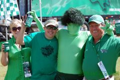
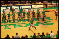
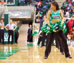
  • What's going on Mean Green?

    1. 108

      Morris signals it is over

    2. 7

      Missouri State to C-USA

    3. 22

      AAC Softball Tournament

    4. 20

      Chrisdon Morgan

    5. 53

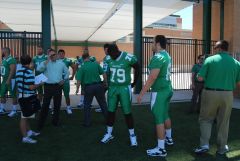
      Meet today's 2024-25 Mean Green???

  • Popular Contributors

  • Member Statistics

    • Total Members
      15,385
    • Most Online
      1,865

    Newest Member
    FairfieldFan
    Joined
×
×
  • Create New...

Important Information

We have placed cookies on your device to help make this website better. You can adjust your cookie settings, otherwise we'll assume you're okay to continue. Please review our full Privacy Policy before using our site.