


-
Tell a friend
-
What's going on Mean Green?
-
5
How Mean Green softball is shaping up in 2025 and beyond
They were part of Senior Day....for whatever that's worth. -
27
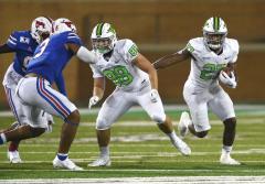
Former Drake Guard Atin Wright commits to North Texas
Uhhh... because unlike AAA affiliates and major league teams, we compete with the money wielding programs. Huge difference- 1
-

-
5
How Mean Green softball is shaping up in 2025 and beyond
Truitt and Donohoe are listed as juniors on the official roster. Did they graduate and decide not to return? -
27
Former Drake Guard Atin Wright commits to North Texas
I am not sure what’s wrong about this . It’s a money earning potential comment with the power 5 paying the major league bucks .- 1
-
-
5
How Mean Green softball is shaping up in 2025 and beyond
I haven't been disappointed in how we've done in conference play. We're gonna finish anywhere from 17-10 to 20-7 in league play. Was disappointed in how we didn't compete against name teams, in OOC play. I do think the future is bright. I think those incoming recruits are very talented. (especially the pitchers from Michigan and Tennessee). And I think Ausha Moore, will be another speed merchant like Cierra is. One more thing: I think Madison Conley will be our next great power hitter.- 1
-
-
-
Popular Contributors
-
1

-
2

-
3
-
4

-
5
-
-
Member Statistics
-


Recommended Posts
Join the conversation
You can post now and register later. If you have an account, sign in now to post with your account.
Note: Your post will require moderator approval before it will be visible.