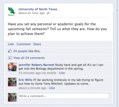
Jump to content

One person's hat design. I'd wear this,


FirefightnRick

Recommended Posts

user posted image

Someone dropped this hat off for me to post and let me say, this is the true KELLY green that we all wore back in the 80's. As you can see it's bright and I like it.

A few things I would improve upon with this hat design is to eliminate the lightning bolt since MTSU's horse uses that, have it with black top button and vent holes and I would outline all the white lettering with black or use a combination of both black and white.

Thoughts?

Rick

Edited by FirefightnRick
Link to comment
Share on other sites

I'd wear it, but I wouldn't buy it.  Everything should display the new logos/fonts.  It can still have just "NT", but with one of the Eagle logos and Mean Green in official font.

If the new MG gear branding takes as long to be available in stores as when Helwig and company's were back in 1995, we all might have a 3 year wait before any stores (outside of Denton's who sometimes take their time, too); anyway, it may be a while before any DFW stores carry any of our new officially licensed stuff. Look at TV coverage of NT, they are still using the fonts and logos from the Helwig era, ie, the UNT in the circle with the burnt orange and dark blue. blink.gif

I think we all see UT and TAMU gear in so many different fonts and styles, its hard to determine what their school's officials have now as their official "up-dated" brandings.

Of course, on the other side of that coin, we didn't have Lids type stores (for us in the Big Cities) in the mid-90's, either, whose main focus is college and pro caps. The ones in the post above are super, super nice but who the heck outside this board knows what eagles those represent? Many transplants (or even native Texans for that matter) in the DFW area would swear those 2 caps represent the Philadelphia Eagles. sad.gif

Edited by PlummMeanGreen
Link to comment
Share on other sites

user posted image

I like the sculptured eagle better.

I liked that new NT eagle logo from the git-go; now if they could have just put an "N T" near the eagle then you have a "non Philly Eagle" winner of a cap!

Of course concerning this subject, I thought Rick V and NT Athletics were sorta' pushing, uh, "Mean Green" over anything of an "eagle'ish" nature? Also, if all will recall, this new eagle logo did not come from (or came as a suggestion from) the NT Athletic Department, either. rolleyes.gif

When Fry was once asked why he chose to emphasize Mean Green over Eagles, he said there is only "1" Mean Green in NCAA D1 college athletics and numerous schools with eagles as their mascot.

Edited by PlummMeanGreen
Link to comment
Share on other sites

Join the conversation

You can post now and register later. If you have an account, sign in now to post with your account.
Note: Your post will require moderator approval before it will be visible.

Guest
Reply to this topic...

×   Pasted as rich text.   Paste as plain text instead

  Only 75 emoji are allowed.

×   Your link has been automatically embedded.   Display as a link instead

×   Your previous content has been restored.   Clear editor

×   You cannot paste images directly. Upload or insert images from URL.


×
×
  • Create New...

Important Information

We have placed cookies on your device to help make this website better. You can adjust your cookie settings, otherwise we'll assume you're okay to continue. Please review our full Privacy Policy before using our site.