Jump to content

What UNT helmet logo would you prefer?


UNTLifer

Recommended Posts

One key to effective branding is repetition and frequency. If a person flips on the TV in the middle of a play and sees the ball about to be snapped they will see "North Texas" on the helmet. It is an instant get. They dont have to ask anyone in the room. And they see that play after play after play.

Exactly right, and that is a great plan.....as long as merchandising isn't a part of it.

People want to identify with what is on the helmet when it comes to merchandise. So this would explain why we are behind such schools as Texas St and UTSA on that subject.

Rick

  • Upvote 1
Link to comment
Share on other sites

Exactly right, and that is a great plan.....as long as merchandising isn't a part of it.

People want to identify with what is on the helmet when it comes to merchandise. So this would explain why we are behind such schools as Texas St and UTSA on that subject.

Rick

True dat...which is why less that 10% in this poll want "North Texas" - less than 6% the "North Texas" we have now.

Sorry. It just doesn't look cool. It isn't memorable. It isn't at all interesting. It doesn't get people interested in buying merchandise. It looks like a gigantic give up. It's horribly boring to the outside world...and, to 90%+ of the inside world.

And, the craziest thing is, we are supposed to be know as a school with artsy-fartsy types on the north side of the campus...and, this is all we can do for a logo?

Worm was fantastic. The Corky Nelson/Scott Davis era helmets were a step in the right direction.

A wise thing to do in our move "up" to C-USunBelt would be to change our logo to something attractive, interesting...and desired by people who spend money on t-shirts and hats and whatnot.

Such can be done in a fun way by taking these steps that would involve both alumni and student body:

-Start a contest now among the student body to come up with a new helmet logo with deadline for entry being the weekend before the spring game.

-Ballot the alumni during the spring game.

-Ballot the students during the last couple of weeks of school.

-Tally and keep secret until fall practice.

-Let the student whose design wins do the coin toss before the home opener versus Idaho.

Ideas. Water them. Nurture them. Let your dog fertilize them so they can grow.

Edited by The Fake Lonnie Finch
  • Upvote 3
  • Downvote 2
Link to comment
Share on other sites

Many on this board suffer from the "Curse of Knoweledge" We know who we are so it clouds how we think the world should see us. The casual college football fan though really has no clue.

One key to effective branding is repetition and frequency. If a person flips on the TV in the middle of a play and sees the ball about to be snapped they will see "North Texas" on the helmet. It is an instant get. They dont have to ask anyone in the room. And they see that play after play after play.

Put the SOW or interlocking NT and they wont know until an announcer says it or they look to the score (if it is on screen.)

Bash him all you want but from a branding perspective (introduction/education to/of the consumer) RV is doing it the right way. Especially considering we've never had any helmet design last more than 6-7 years in our Div 1/FBS history.

With all due respect, I have to disagree. In this day and age, when you turn on a televised game the shot is usually panned back and not a close up on the helmet and the score is always posted somewhere on the screen, usually the top. The score includes team names and time left. I would venture a guess that most viewers look to this stat bar to determine who is playing and what the score is when they first turn on a game.

  • Upvote 2
Link to comment
Share on other sites

With all due respect, I have to disagree. In this day and age, when you turn on a televised game the shot is usually panned back and not a close up on the helmet and the score is always posted somewhere on the screen, usually the top. The score includes team names and time left. I would venture a guess that most viewers look to this stat bar to determine who is playing and what the score is when they first turn on a game.

Exactly.

And, so, what is left for the average viewer? After taking in the score and stats, what is there left for the average viewer? The words "North Texas."

Marketing makes money. Complain about "t-shirt fans" all you want, but those schools that have them are making money from their bandwagoning. We will never have to worry about making money from bandwagoners as long as we have an uninteresting logo.

  • Upvote 2
Link to comment
Share on other sites

Exactly.

And, so, what is left for the average viewer? After taking in the score and stats, what is there left for the average viewer? The words "North Texas."

Marketing makes money. Complain about "t-shirt fans" all you want, but those schools that have them are making money from their bandwagoning. We will never have to worry about making money from bandwagoners as long as we have an uninteresting logo.

No. This is not the reason we won't have bandwaggon fans or make money.

We won't have bandwaggon fans or make money if we're not winning.

Edited by MeanGreenTexan
  • Upvote 3
Link to comment
Share on other sites

They weren't jumping aboard the "North Texas" script bandwagon when we were winning and going to four consecutive bowl games.

Win, lose, or draw, we do not have a marketable logo.

That was a different time/mindset (although not that long ago), and I think you know that.

During that fantastic run, we were in a perceived weak league (and even though C-USA is not much stronger with the defections, the perception will be different). We were still playing at Fouts. Administration backing was low. Student buy-in was low.

Not to mention that any momentum we DID build during those years was squashed on the field from Dickey's last year through today.

Those problems have been addressed now. The tide is turning... we just need to win.

  • Upvote 1
Link to comment
Share on other sites

People still bought hats and t-shirts from 2001-2004. The "North Texas" script was not a popular seller despite the winning.

"North Texas" is not going to suddenly sell if we start winning next year or the year after. Southern Miss won for several years and went to several consecutive bowl game, and the result was the same...crappy logo, few sales of merchandise beyond the diehard fans.

Sticking with "North Texas" is a losing proposition. It will never market well. There is nothing appealing about it - even to the vast majority of alumni and fans.

That 90% of the fans polled here want either Worm, SOW, or some sort of letters tells you what will market. It isn't difficult. Why our athletic department fights reality is beyond comprehension.

Who here knows what Southern Miss sold? We're not in Mississippi. I highly doubt I'd see alot of Southern Miss stuff in DFW regardless. Rutgers is winning and going to BCS bowls. They're a large state university, and I don't see any Rutgers gear in DFW either. Plus, any Southern Miss stuff I do see is usually something like this:

southern_mississippi_logo-1.jpg

... not what is on their helmets.

Same goes for us with the SOW.

Here's a clue. Now that we're with Nike, what did they choose for the 100 Year t-shirt logo? It wasn't "North Texas." It is Worm.

I think, probably, Nike might know a little more about marketing a brand than the North Texas athletic department.

Better check again. This was not Nike's design. It was an alum's recreational design.

  • Upvote 1
Link to comment
Share on other sites

Who here knows what Southern Miss sold? We're not in Mississippi. I highly doubt I'd see alot of Southern Miss stuff in DFW regardless. Rutgers is winning and going to BCS bowls. They're a large state university, and I don't see any Rutgers gear in DFW either. Plus, any Southern Miss stuff I do see is usually something like this:

southern_mississippi_logo-1.jpg

... not what is on their helmets.

Same goes for us with the SOW.

Better check again. This was not Nike's design. It was an alum's recreational design.

So you are saying that you like the North Texas on the helmets?

  • Downvote 1
Link to comment
Share on other sites

Who here knows what Southern Miss sold? We're not in Mississippi. I highly doubt I'd see alot of Southern Miss stuff in DFW regardless. Rutgers is winning and going to BCS bowls. They're a large state university, and I don't see any Rutgers gear in DFW either. Plus, any Southern Miss stuff I do see is usually something like this:

southern_mississippi_logo-1.jpg

... not what is on their helmets.

Same goes for us with the SOW.

Better check again. This was not Nike's design. It was an alum's recreational design.

well...that Southern Miss eagle head logo blows away our professionally done SOW and its not even close.

They should put that on their helmet as opposed to the awful looking Southern Miss spelled out....1983 called and they want their logo back...

Edited by 3XL
  • Upvote 1
Link to comment
Share on other sites

well...that Southern Miss eagle head logo blows away our professionally done SOW and its not even close.

They should put that on their helmet as opposed to the awful looking Southern Mississippi spelled out....1983 called and they want their logo back...

You are f'n looney tunes. That logo looks like the old daffy eagle.

  • Upvote 3
  • Downvote 2
Link to comment
Share on other sites

Daffy is really a misleading nickname...when you say daffy it sounds cartoon like...

Our eagle from 1995-2000 was nicely done...looked like the eagle that the NFL Philadelphia Eagles use in their marketing.

It's a traditional eagle logo and not a cartoon eagle...like say..."Scrappy smiling in a letter sweater and ball cap".

SOW is so bad...that we can't even figure out how to make it look good on a helmet.

It's a weak mark that is over blown, unbalanced, exaggerated, life-less, simplistic, monochromatic, misproportioned,

goofy and always reminds me of screaming chicken.

Anyway...like I have stated before....I really support branding "mean green" and the interlocked NT.

Edited by 3XL
  • Upvote 4
  • Downvote 4
Link to comment
Share on other sites

Daffy is really a misleading nickname...when you say daffy it sounds cartoon like...

Our eagle from 1995-2000 was nicely done...looked like the eagle that the NFL Philadelphia Eagles use in their marketing.

It's a traditional eagle logo and not a cartoon eagle...like say..."Scappy smiling in a letter sweater and ball cap".

SOW is so bad...that we can't even figure out how to make it look good on a helmet.

It's a weak mark that is over blown, unbalanced, exaggerated, life-less, simplistic, monochromatic, misproportioned,

goofy and always reminds me of screaming chicken.

Anyway...like I have stated before....I really support branding "mean green" and the interlocked NT.

Opinions are nice because everyone has one, some better than others and some that are off base

  • Upvote 1
  • Downvote 1
Link to comment
Share on other sites

That 90% of the fans polled here want either Worm, SOW, or some sort of letters tells you what will market. It isn't difficult. Why our athletic department fights reality is beyond comprehension.

This was the same opinion two major hat manufacturers asked Silver and I when we first approached them about getting involved with a contract to do Mean Green gear. Their previous history with North Texas...(during the Daffy Eagle and Scripted North Texas era's)..led both to say our previous logos were unattractive and very bland for such a large school and alumni base. One gentleman asked me out right..."Why can't North Texas get their shit together....they are leaving money on the table".

And here we are....10 years later....still leaving money on the table.

By the way, we produced several items with the ol' Flyin Worm on them and couldn't keep them in stock. That is an extremely popular logo with the alumn who appreciates college nostalgia, which I think is why the new SOW has been such a hit. It represents the old and the new in all of us.

Rick

Edited by FirefightnRick
  • Upvote 1
Link to comment
Share on other sites

SOW is so bad...that we can't even figure out how to make it look good on a helmet.

It's a weak mark that is over blown, unbalanced, exaggerated, life-less, simplistic, monochromatic, misproportioned,

goofy and always reminds me of screaming chicken.

Anyway...like I have stated before....I really support branding "mean green" and the interlocked NT.

20091209raaf8186190_2501.jpg

Looks pretty F'in good on the tail of an F/A-18. Your argument is invalid.

  • Upvote 5
Link to comment
Share on other sites

that's not fair...you brought a F-18 into this discussion...ha! plus this is a discussion not an argument...

in my opinion...this is better for a college football helmet...and the fighter jet can keep SOW...that's pretty cool...even if it's photoshoped!

sometimes...."less is more"

Edited by 3XL
  • Upvote 1
  • Downvote 1
Link to comment
Share on other sites

that's not fair...you brought a F-18 into this discussion...ha! plus this is a discussion not an argument...

in my opinion...this is better for a college football helmet...and the fighter jet can keep SOW...that's pretty cool...even it's photoshoped!

sometimes...."less is more"

Sometimes less is more yet you complain that SOW is "simplistic, monochromatic,"?

  • Upvote 1
  • Downvote 1
Link to comment
Share on other sites

yes...those are 2 our the 8 words that I used to discribe our bird...

if I had discribe SOW quickly to someone...say on an elevador ride from the 1st floor to 2nd floor...using only 2 adjectives...I would say it's "unbalanced & exaggerated"

Link to comment
Share on other sites

Daffy is really a misleading nickname...when you say daffy it sounds cartoon like...

Our eagle from 1995-2000 was nicely done...looked like the eagle that the NFL Philadelphia Eagles use in their marketing.

It's a traditional eagle logo and not a cartoon eagle...like say..."Scrappy smiling in a letter sweater and ball cap".

SOW is so bad...that we can't even figure out how to make it look good on a helmet.

It's a weak mark that is over blown, unbalanced, exaggerated, life-less, simplistic, monochromatic, misproportioned,

goofy and always reminds me of screaming chicken.

Anyway...like I have stated before....I really support branding "mean green" and the interlocked NT.

That was one of the main issues. It is so pop warner/high school when we use a logo that looks like a pro team's. I never want art that resembles any other's.

Link to comment
Share on other sites

yes...those are 2 our the 8 words that I used to discribe our bird...

if I had discribe SOW quickly to someone...say on an elevador ride from the 1st floor to 2nd floor...using only 2 adjectives...I would say it's "unbalanced & exaggerated"

Interesting. I would describe it as an "attacking" "eagle". And I'd wager they would get what I was saying before the door even closed.

Regardless - a logo doesn't really mean anything on its own. It's just a picture. It is the company or in this case school/team that give it its meaning. That simplistic, monochromatic, apple logo is just a chrome apple without the gee whiz products they produce. That simple, monochromatic longhorn is just an orange cow head without the Heisman's, National Championships, etc they've won.

We win, at a high level, consistently for years, and whatever we have on our helmets, jerseys, pants, hats etc will be held in high esteem by fans and respected by our foes.

  • Upvote 2
  • Downvote 1
Link to comment
Share on other sites

Join the conversation

You can post now and register later. If you have an account, sign in now to post with your account.
Note: Your post will require moderator approval before it will be visible.

Guest
Reply to this topic...

×   Pasted as rich text.   Paste as plain text instead

  Only 75 emoji are allowed.

×   Your link has been automatically embedded.   Display as a link instead

×   Your previous content has been restored.   Clear editor

×   You cannot paste images directly. Upload or insert images from URL.


  • Tell a friend

    Love GoMeanGreen.com? Tell a friend!
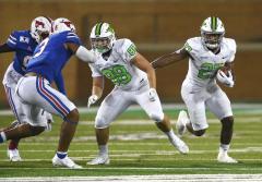
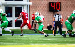
  • What's going on Mean Green?

    1. 15

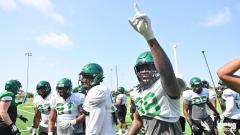
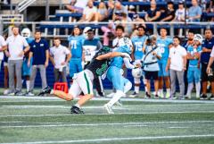
      Mean Green Invasion of Lubbock

    2. 19

      ESPN Football Power Index
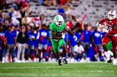
    3. 2

      '25 S Offer: Zaylen Cormier, Houston Heights: 3 star

  • Popular Contributors

  • Member Statistics

    • Total Members
      15,391
    • Most Online
      1,865

    Newest Member
    FairfieldFan
    Joined
×
×
  • Create New...

Important Information

We have placed cookies on your device to help make this website better. You can adjust your cookie settings, otherwise we'll assume you're okay to continue. Please review our full Privacy Policy before using our site.