Jump to content

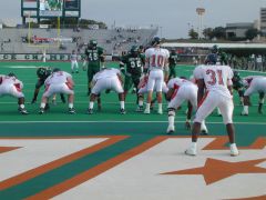
Scrap The Spelled Out "North Texas" on the Helmet!


PlummMeanGreen

Recommended Posts

I am sure the "North Texas" will grow on us eventually, but don't most schools in NCAA D1-A merely use their school's abbreviations or a simple logo, ie, UT and SMU?

I've seen some very nice 2 letter "N T" 's on this message board created by some of you digital graphic artists. When you put 2 letters on your helmet you have some room to work with as to make those 2 letters quite large, much larger than having the 10 letters on a helmet that are in the 2 words......."North Texas."

Yet who could get "N T" confused when its on a Mean Green football helmet? We know few would ever think those 2 letters stand for, uh, "Northern Telecom". rolleyes.gif Last I checked, Northern Telecom does not have a football team at any level of the NCAA. ohmy.gif

NT surely will never be known in sports circles for having much imagination in creating the good uniform look, helmets included. But that is my my .02 on that subject and we know there are a few of those on GMG.com. smile.gif

GMG!

Edited by PlummMeanGreen
Link to comment
Share on other sites

I liked the new look and new shade of green the helmets used.  It was more of a D1A look IMO.

Was that a different shade of green ? It looked exactly the same on TV. Also, the new lettering is barely legible from a distance. IMHO it's a BAD look ! But as long as we keep winning, I won't get too bent out of shape. Please NO BLACK PANTS !

Link to comment
Share on other sites

Was that a different shade of green ? It looked exactly the same on TV. Also, the new lettering is barely legible from a distance. IMHO it's a BAD look ! But as long as we keep winning, I won't get too bent out of shape. Please NO BLACK PANTS !

No, it was the same green as last year. They didn't have time to change the green for this season before the order was due so it will be next year when we get the new color on the unis.

I like the new logo font better than the script. And I was afraid they were going to make the Texas smaller then North as in the decals they gave out with the season tickets. I'm glad they kept the words the same size and just offset them. It could be larger to be more visable from a distance, and better yet would be just a NT on them! cool.gif

Link to comment
Share on other sites

No, it was the same green as last year.  They didn't have time to change the green for this season before the order was due so it will be next year when we get the new color on the unis. 

I like the new logo font better than the script.  And I was afraid they were going to make the Texas smaller then North as in the decals they gave out with the season tickets.  I'm glad they kept the words the same size and just offset them.  It could be larger to be more visable from a distance, and better yet would be just a NT on them!  cool.gif

The helmets looked a little lighter and less metallic. Oh well, it was probably the lighting. biggrin.gif

Link to comment
Share on other sites

Join the conversation

You can post now and register later. If you have an account, sign in now to post with your account.
Note: Your post will require moderator approval before it will be visible.

Guest
Reply to this topic...

×   Pasted as rich text.   Paste as plain text instead

  Only 75 emoji are allowed.

×   Your link has been automatically embedded.   Display as a link instead

×   Your previous content has been restored.   Clear editor

×   You cannot paste images directly. Upload or insert images from URL.


×
×
  • Create New...

Important Information

We have placed cookies on your device to help make this website better. You can adjust your cookie settings, otherwise we'll assume you're okay to continue. Please review our full Privacy Policy before using our site.