


-
Tell a friend
-
What's going on Mean Green?
-
60
On a scale of 1 to 10...
NIL/portal has lessened my interest in college football in general but my lack of enthusiasm for this season mostly revolves around Morris. The lack of a defense kills my confidence in a good season (and then anyone worth a damn will get plucked by a p4). -
4
The 15 FBS teams not playing an FCS Opponent
Alabama = 85 scholarships North Texas = 85 scholarships SFA = 63 scholarships Red Apple, Green Apple, and a Plum. Name two that are more alike. -
3
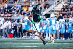
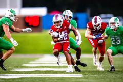
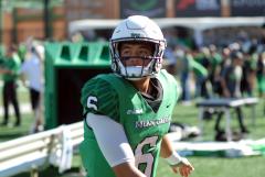
UNT Football Annouces Summer Transfers
Hope they can tackle.... any of them. Don't know how much more of what I watched last season I can endure.- 3
-

-

-

-
28
Looking to discuss, or debate: the future of CFB.
That's where the rankings will come under fire. When 8-4 Washington beats out 10-2 Clemson for the at-large playoff spot (because they lost to four Big10 teams vs two ACC teams) then pitchforks will come out. -
4
The 15 FBS teams not playing an FCS Opponent
Except that early in the season, you can play younger players in a game that you should be able to win anyway. Also, it is a chance to get game time for players that did not go through Spring. It is also a home game, and after MANY years of only 4 home games, I'll take the FCS opponent and a win. There are reasons for us to do it just like there are reasons for Alabama to play someone like us.- 1
-
-
-
Popular Contributors
-
Member Statistics
-


Recommended Posts
Join the conversation
You can post now and register later. If you have an account, sign in now to post with your account.
Note: Your post will require moderator approval before it will be visible.