

-
Who's Online 0 Members, 0 Anonymous, 194 Guests (See full list)
- There are no registered users currently online
-
Images


-
Tell a friend
-
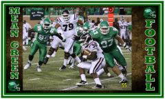
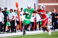
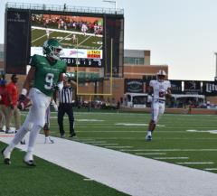
What's going on Mean Green?
-
5
In the new NIL era how should UNT athletics be focused?
Title IX still applies, right?- 1
-

-
3
Weather (5/28/2024)
Power just came on from 6:00am this morning. Central and East Dallas got hammered. Lots o old big trees to snap the power lines. Bars packed watching the Mavs game! GMG -
3
Weather (5/28/2024)
Got 4 inches of rain in about a 3 hour time frame. Never lost power. -
3
Weather (5/28/2024)
Lost power for a few hours. A few trees down in the neighborhood. -
-
-
Popular Contributors
-
1
-
2

-
3

-
4

-
5

-
-
Member Statistics
-


Recommended Posts
Join the conversation
You can post now and register later. If you have an account, sign in now to post with your account.
Note: Your post will require moderator approval before it will be visible.