
UNTcrazy727
-
Posts
3,659 -
Joined
-
Last visited
-
Days Won
5 -
Points
38,080 [ Donate ]
Content Type
Profiles
Forums
Gallery
GoMeanGreen.com
Everything posted by UNTcrazy727
-
 No, we just copied a trend that's been going on for about a decade.
 -
They've been wearing it the past year or so. Don't expect it to be available to us anytime soon.
-
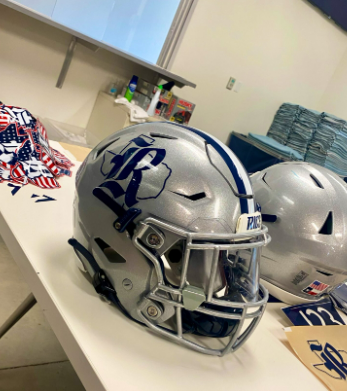
Don't forget Rice and Texas State!

-
But it’s hard to claim the Texas silhouette when countless high schools and colleges have already done it. Not unique or creative.
-
I agree with you on preferring "North Texas" and "Mean Green". That's why I'm such an advocate for the interlocking "NT" and strongly dislike the subtle, yet noticeable shift we've been taking towards "UNT".
-
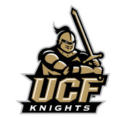
Even if you think UCF's Black Knight logos are just "okay" its still better than what we have. And you can't compare UNT to 3 of the most recognizable NFL teams that have had the same logos almost their entire existence. That's apples and oranges. But even if you do, I'd argue the Cowboys have a more in-depth active roster of logos than UNT. They have the star, the capital D, throwback Cowboy (riding horse), throwback star logo...while we just have the SOW, Flying Worm, and generic word/letter marks. You're right, we don't need a new eagle every 10 years. At this point, I think the SOW has been around long enough that it needs to be the focal point of our brand. It should be to us what the Longhorn and Mustang logos are to UT and SMU. That's why I dislike the push that's been going on recently of including the university letter mark with the SOW. To improve our branding I don't think we need brand new logos. All we have to do is look to our past for inspiration while using what we currently have... 1. Keep the SOW as the focal point. It should have a presence on every field, uniform, broadcast, etc. 2. Greatly reduce the use of the UNT letter mark for athletics and bring back the interlocking "NT". And to stay in line with university branding keep the current font of the UNT letter mark. Small adjustments would be needed on the width and length of the letters. This would give us a secondary logo that pays homage to multiple eras of UNT athletics. And as we saw with the Mean Joe Greene throwbacks, the "NT" looks great on helmets. 3. Take a page out of Tulane's and Buffalo's playbook and bring back a beloved logo/character that gives a face to your brand. My choice would be this sweet bastard. Since the SOW is the main logo, I'd mostly limit this guy to merch like hoodies and tshirts and as an alternate helmet decal like Buffalo did.
-
That's my whole point. The vast majority of university letter marks are painfully generic. That's why most universities, like UCF, allow their athletics department to have their own dynamic branding.
-
Let me rephrase, UTSA is loaded with super seniors and expecting to compete for a conference title. We are not.
-
UNT admin: “Whoops!”
-
In honor of the thread being restored here's another school that gets it! UCF university letter mark: UCF athletics mark:

-
I think Sohn's quote is actually brutally honest. He basically said UTSA pulled the scholarship offer for next fall because they wanted someone who could contribute and not redshirt. Like JD mentioned, UTSA is trying to win BIG next year and oline isn't a big strength so they need as many bodies as possible. Whereas, our oline is already set and we're not in "win now" mode so we're fine with him probably redshirting.
-
Thank you for explaining this so well. Sellouts are a good thing! You want people turned away because that makes it more likely they will purchase season tickets. It also allows you to charge higher ticket prices. Playing in a massive arena that you can never fill devalues the importance of season tickets and limits what you can charge.
-
According to Vito's article it was due to Sohn's injuries and UTSA having a lineman come back.
-
No doubt!
-
If an unranked recruit with only low level G5 and FCS offers is a $100 bill then we have problems.
-
They also just lost their coach who was responsible for that great run and are in a lower conference than us now. This kid may end up being great signing. I just don't see what makes him such an amazing get right now when he has no ranking and only has low level G5 and FCS offers. I'll just hope our coaches see something that UTSA, SMU, Rice, Tulane, Tulsa, etc. don't.
-
Watching a highlight tape isn't going to tell you everything. Anyone can make themselves look great cherry picking their best moments.
-
Guess I have to ask what makes a guy with no rating such a big win? And its not like we beat out a lot of top G5 programs...
- 33 replies
-
- 18
-

-

-

-

-

-
-
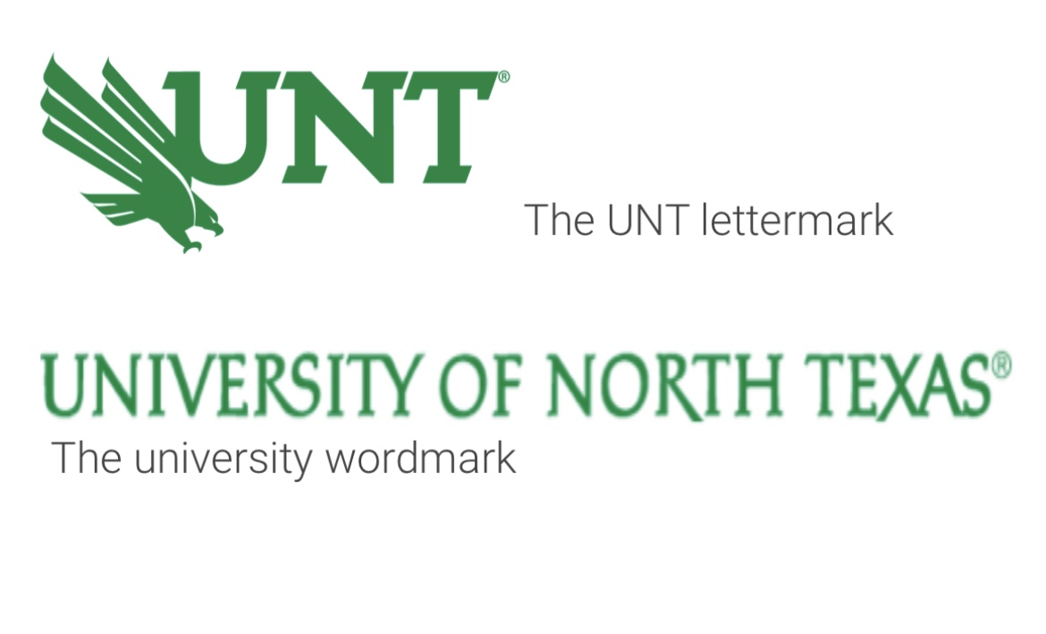
Another conference mate who is smart enough to realize you shouldn't use University marks for Athletic branding. University mark: Athletic mark:
-
I don’t hate the SOW as much as you seem to. I hope we keep it around. But I will say it’s a flat logo devoid of any character. And you’re right about it being a bad helmet logo. That’s why I’ve always been a fan of bringing back the interlocking NT logo using our current font. At least it’d give us a secondary logo that would look good on a helmet.
-
I think you're getting upset over nothing. The link you always get mad about even states Green is our primary color and White and Black are secondary. I disagree with classifying White as secondary, but I understand why they say that when it comes to styling university communications. Green should be the primary color for that. The site is just saying Black is considered an official/accepted color when it comes to communications, not that its a primary color on the same level as Green.
-
I hate the overall design. It's incredibly lazy and bland. Considering we have one of the most unique and recognizable nicknames, our branding is extremely boring. From my limited research it seems rare for athletics departments not to have their own branding that slightly or greatly differs from the University branding. Boring and bland works for universities, not for athletics. Just look at how UTSA's athletics branding differs from the University... Unlike UNT where we lazily pasted our Eagle in front of the University letter mark, UTSA used some imagination and spruced up the font, centered the Roadrunner and made an ACTUAL LOGO. It blows our lazy excuse for a logo out of the water...

-
Light The Tower Master Plan Update
UNTcrazy727 replied to MeanGreen22's topic in Mean Green Football
Seems to be the plan!
-
This is the official UNT lettermark, which in recent years has started taking a prominent position in our athletic branding. It’s even the logo we instruct ESPN to use. Slapping the eagle in front of the UNT script is as lazy as you can be.
-
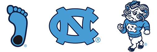
I think the UNT admin agrees. Unfortunately, I think they’re addressing it in the wrong way. Instead of allowing Athletics to develop their own lasting brand, the university is forcing them to use the existing University branding. The flaw in this thinking is what works for a University in terms of branding/logos doesn’t work for athletics teams. Sports logos need to be exciting and colorful so they catch your eye and make you want to buy merch. While University branding is only interested in being simple and to the point. Take a look at other universities and their athletic departments. The universities have their simple abbreviation scripts and crests, while the athletic departments elevate them into actual logos with character. Here’s UNC as an example: University: Athletics: