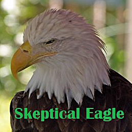
UNTcrazy727
-
Posts
3,666 -
Joined
-
Last visited
-
Days Won
5 -
Points
38,370 [ Donate ]
Content Type
Profiles
Forums
Gallery
GoMeanGreen.com
Everything posted by UNTcrazy727
-
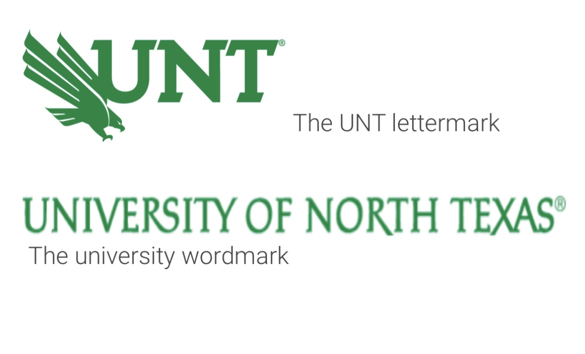
 Another conference mate who is smart enough to realize you shouldn't use University marks for Athletic branding. University mark: Athletic mark:
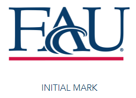
-
I don’t hate the SOW as much as you seem to. I hope we keep it around. But I will say it’s a flat logo devoid of any character. And you’re right about it being a bad helmet logo. That’s why I’ve always been a fan of bringing back the interlocking NT logo using our current font. At least it’d give us a secondary logo that would look good on a helmet.
-
I think you're getting upset over nothing. The link you always get mad about even states Green is our primary color and White and Black are secondary. I disagree with classifying White as secondary, but I understand why they say that when it comes to styling university communications. Green should be the primary color for that. The site is just saying Black is considered an official/accepted color when it comes to communications, not that its a primary color on the same level as Green.
-
I hate the overall design. It's incredibly lazy and bland. Considering we have one of the most unique and recognizable nicknames, our branding is extremely boring. From my limited research it seems rare for athletics departments not to have their own branding that slightly or greatly differs from the University branding. Boring and bland works for universities, not for athletics. Just look at how UTSA's athletics branding differs from the University... Unlike UNT where we lazily pasted our Eagle in front of the University letter mark, UTSA used some imagination and spruced up the font, centered the Roadrunner and made an ACTUAL LOGO. It blows our lazy excuse for a logo out of the water...

-
Light The Tower Master Plan Update
UNTcrazy727 replied to MeanGreen22's topic in Mean Green Football
Seems to be the plan!
-
This is the official UNT lettermark, which in recent years has started taking a prominent position in our athletic branding. It’s even the logo we instruct ESPN to use. Slapping the eagle in front of the UNT script is as lazy as you can be.
-
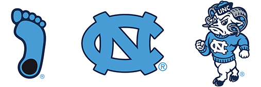
I think the UNT admin agrees. Unfortunately, I think they’re addressing it in the wrong way. Instead of allowing Athletics to develop their own lasting brand, the university is forcing them to use the existing University branding. The flaw in this thinking is what works for a University in terms of branding/logos doesn’t work for athletics teams. Sports logos need to be exciting and colorful so they catch your eye and make you want to buy merch. While University branding is only interested in being simple and to the point. Take a look at other universities and their athletic departments. The universities have their simple abbreviation scripts and crests, while the athletic departments elevate them into actual logos with character. Here’s UNC as an example: University: Athletics:

-
Why does next year have. To be a rebuilding Year?
UNTcrazy727 replied to Jonnyeagle's topic in Mean Green Football
Jake is a good receiving TE so I think he would fit fine. It's just Gumms is a better fit and would have seen more touches. I don't blame Jake at all for wanting to get more touches at the P5 level than he would have gotten here next year. -
2008-2011 -Central Grill -Crooked Crust (2 slices and a drink for $5 was clutch at 2 AM) -Mr. Chopsticks -Tortilleria La Sabrocita -Roosters
-
I might order one of these in grey because I love the logo so much. But your post really shows how many throwback logos we have that fans love. We shouldn't have to order iron-ons to create our own shirts. There should always be QUALITY merchandise with a few of these logos available to purchase at Voertman's, UNT bookstore, Rally House, etc.
-
I don't agree with your hatred of black apparel. I have a large amount of black UNT gear. It does nothing to distract from traditions or school spirit. That said, I will agree with you that the vast majority of our apparel should be green. Sadly, that hasn't been the case the past few years. You're putting a lot of blame on Nike and Voertman's when a major chunk lies with UNT. They could put a lot more pressure on vendors to order more green gear, but they just don't care.
-
Throwback gear is massive right now and UNT has totally missed the boat so far. The biggest player in college throwback gear, Homefield Apparel, has throwback lines for 150+ schools and unsurprisingly, UNT is not one of them. We have a plethora of cool throwback logos, but for some reason UNT doesn't want to profit off any of them besides the flying worm.
-
I hope you're not looking for green North Texas Nike gear. There ain't much out there.
-
Love Shack was great. I was pissed when Tim Love decided to close it down so he could open Queenies.
-
Man, I miss their sweet sourdough buns.
-
Not sure when it closed, but sometime during late 90s- early 2000s. It was located where Traditions Hall sits today. I remember going there a lot as a kid.
-
Anyone else excited about the new FIU series?
UNTcrazy727 replied to meangreenfaninno's topic in Mean Green Football
I wouldn’t say we SHOULD beat Cal. They may be a bad PAC 12 team, but they’d still finish towards the top of the AAC. -
^Probably best case scenario
-
Except UTSA and SMU, right??
-
They're both bad CUSA teams, which are games we've fared well in.
-
2023 - Fourth nonconference game
UNTcrazy727 replied to Matt from A700's topic in Mean Green Football
Updated with addition of FIU: Likely wins: La Tech, ACU, Temple, Navy, FIU Toss ups: Cal, Tulsa, Memphis, UAB Likely losses: UTSA, SMU, Tulane Thanks to our very easy OOC schedule, I can see us winning 8 games next year. -
Didn't Mallory Hartley take over when Pickle graduated? https://twitter.com/malloryhartley?lang=en
-
They’re also awful now, which they weren’t most of Seth’s tenure. Seth usually always beat the bottom dwellers. We beat them down last year and I see no reason why we won’t next year.
-
I don't follow? La Tech and FIU are the type of games Littrell always won. Cal will be the interesting OOC game.
-
He lost the fan base when he went 4-8 in 2019 despite tons of expectations.
- 128 replies
-
- 12
-

-

-