Jump to content

Those Uniforms Posted in the Gallery are Sweet!


Mean Green 93-98

It may be a little redundant, and it may still be football season, but I felt those uniforms deserved a discussion thread.

gallery_36865_92_27051.jpeg

gallery_36865_92_14382.jpeg

gallery_36865_92_5701.jpeg

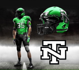
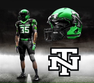
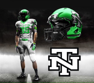
Black football uniforms still leave a bad taste in my mouth . . . but if we were to use an alternate 3rd black uniforms, that would be the uniform I would want.

Awesome job, 817 Fan.


User Feedback

Recommended Comments


I'm all for having "tradition" and not changing unis every year. I love the PSU, UT, etc jerseys. But we are not those schools and out our unis have not been the same for more then 4 yrs at at time.

That being said I won't say our current unis are the worst out there bc there are some god awful ones out there, but they are probably the most boring unis in NCAA...and not in a good way.

  • Upvote 3
Link to comment
Share on other sites

Trying to find the article, but on one of the Sports talk shows they were saying that one of the things recruits are considering more today than ever before is the uniforms. Not sure how much of an impact, but with a name like “Mean Green” we should be more creative

Amen! Our unis don't do anything to leverage/enforce this. I think the helmet color is closer to "powder puff" green than "mean". The green from our unis should scream at you. As much as I prefer the darker, forest green, I'd be open to a neon green if it gave us a good look.

Link to comment
Share on other sites

Since 1961 I have seen more shades of green and shapes of eagles that I thought ever existed. I love this new NT helmet, which to me combines the old with the new. However, Rick is boxed in. If he uses initials,Jackson will demand UNT, which puts us lost with UAB,UCF,FAU,FIU,ECU,etc. To avoid that, we will continue to use NORTH TEXAS , which I would to see combined with the SOW. That is what you need to sell to Rick.

I was fed up with Jackson a long time ago. He should tend to what he was hired to do. Which is to raise money and garner influence for this University. I can't wait for him to be gone.

Link to comment
Share on other sites

Amen! Our unis don't do anything to leverage/enforce this. I think the helmet color is closer to "powder puff" green than "mean". The green from our unis should scream at you. As much as I prefer the darker, forest green, I'd be open to a neon green if it gave us a good look.

Neon?! Ick. C'mon, man.

I'm very glad to hear the positive comments on these "proposed" uniforms. My past is in advertising art and present is 15+ years in sales and marketing.

....in sales....I have learned..."if it looks better it will sell better"...in ad art I learned that sometimes "less is more".

I have always disliked the North Texas spelled out on the helment. Also, not a fan of the "horn" stripe of any kind on pants or jerseys. "Horn stripes" are not old school or new school...just a bad idea on a football uniform. I chose to go with no stripes on pants...ala Texas, TCU & the old A&M looks. Heck even Texas high schools are going away from the "horn stripe" on shinny pants look.

I wanted to "plus" our current uniform look...or simply "make them better"

Here is my thinking and catalyst for creating them. (with the photoshop help of my very talented nephew and his Master's Degree from S.C.A.D.)

1. We have new state of the art stadium...this thing is awesome!

2. We have a new great coach..."sunglasses & muscles" who does'nt love Mac

3. We are entering into C-USA next year...how cool is that ?

4. We need an updated look that both appeals to our fan base and the young recruits. (a little swagger for the team)

Reason for the "Letterman's Jacket" interlocking NT

1. It's a classic collegiate look. (i.e. UNC or NC, Auburn, Notre Dame "ND Alumni do not have gold helment emblems on their cars", Texas Tech, Georgia Tech, Oklahoma, West Virginia, Kentucky, Virginia Tech, Baylor, Colorado, Houston, Indiana, USC or Southern California using interlocking SC on v-neck of jerseys) "we should not put UNT on everything. Texas does not put UT on a baseball hat. North Carolina does not put UNC on a baseball hat...they put NC....trust me I spend 4 weeks a year there."

2. "If we want to be a little bigger...we need a bigger mark"...less of the UNT,FIU, FAU, WKU, UAB, UCF, ECU etc...

3. No other University has the interlocking NT

4. NT is perfectly balanced and symmetrical...makes a great brand or mark for: cars, jackets, hats, suit pins, golf balls, cups, coozies, etc...

5. We used to have it on helment back in the Mean Joe Green days.

6. the NT scale for helment was inspired by Texas A&M's "T" ....really glad we're green and not maroon....can you imagine the "horror" of being saddled with worst color in college football?

Reason for the "Green with Black Accents"

1. They look great together.

2. It's current and looks less 1970's and 1980's

3. NT already uses in our other sports and it's on our football field.

Reason for Updated Green

1. We are the "Mean Green" right? why not brand a cool "mean green" color

2. It's a cross of our old "flying worm" apple green and "Monster Energry Drink/Kawasaki" green

3. Really..anything less "dull" green will work...a little "wow" factor green

Reason for 3rd option or Special "Black Uniform"

1. Watching the Tuesday night NT game "in my hotel room in NC"....I was thinking how cool would it be to have a special "tv night game" or "rival' jersey.

2. Helps with recruiting.

3. I don't want us to always wear all black...that's not it at all....just for a "special" game. Say...SMU?

Reason for State of Texas stamp on the under shirt

1. Tastefully eliminates the need to "spell out" North Texas on the helment.

2. Would need to keep it simple and green...no numbers, logos, words...

I'm trying to get a green on white and green on green mock up done...we'll see? if so....I'll post.

again...thanks for the positive comments!

"go mean green"

3XL

After weighing the reasoning here and comments throughout the thread, I could renig on my comments and see the logic for new uni's next year.... I just don't think these are it.

The only element I could solidly get behind is the Texas (with possibly little asterisk star on our location?) on the undershirt sleeve.

Some of the colors you all are advocating for are silly. The fact that the university bit the bullet with the overall branding rewrite and embraced the multiple colors of green is silly (or simply making the most of a failed history with apparel retail).

With the buzz to our program right now in its upsurge (yes the scores from this year would not suggest so, but we are certainly getting there) coupled with the Nike contract, etc., we should have no problem settling on an actual universal green. Said green should probably be such: "UNT green is Pantone Matching System PMS 356*" from the school's own URCM identity guide.

I'm just sayin'.

  • Downvote 4
Link to comment
Share on other sites

You need to provide Rick with an option that will satisfy Jackson and university standards, what ever they are. Rick went to "Mean Green" because of so many local/regional high schools that were "Eagles". There is no way we are going to have a helmet with just "NT" on it because of reasons I stated before. What you might be able to sell is "NORTH TEXAS" with either the SOW or eagle claw as part of it. As far as green colors,I have 5 green shirts and none match whatever our present flavor of the year is.

Link to comment
Share on other sites

Don't everyone poop on the black uniforms. They look like a play on the Baskeball "Tuxedo" black uniforms. The basketball unis and the black ones here are not the Dickey's final game black and white uniforms.

No, they aren't. But that is not the only issue with black uniforms. Back in the late 1990's when we began using that Emerald green, the university lined the walls in the University Union with small stripes of burgandy and navy blue as accents. When it was mentioned maybe we should use one or both of those colors as accents, not even as the main color for a jersey, it was made very explicitly clear by members on this board that "our colors are green and white." Now everyone wants black jerseys. if they can be done properly, I personally am ok with them for the occaisonal "big game". On the other hand, a "big game" I would think we would want to showcase our school colors more.

My main issue, and I'm sure with others as well, as that I don't want to see the black uniforms replace our green, like many other schools have. Even the basketball team rarely uses green. Maybe they are going to go back to green now, I don't know.

Link to comment
Share on other sites

click on these links for nice collegiate use of interlocking letters for school apparal and uniforms...why not?

think "North Carolina" in green...maybe green on green. A bold, bigger, better mark...classic college look.

forget the "black uni's" and "what shade of green" for a minute...that was for fun & style points. I love our green...."mean green"

http://www.goheels.c...62&SPSID=667864

http://www.usctrojan...ootbl-body.html

Question 1:Why would the University of North Texas need permission from the the Alumni Association for the letterman's interlocked NT?

Simply use the "letterman's" interlocking NT without the star. Many schools use interlock letters...this is not new. It's a classic look. We already use it with our letterman's jackets.

Question 2: Why would the Alumni Association ever deny "their" university of a mark that would help brand "their" school?

They should work together to resolve and make this a "non' issue. This whole issue makes zero sense.

Edited by 3XL
Link to comment
Share on other sites

3XL knows what the hell he is talking about, and I agree with him 100 percent. You use what promotes and sells the best, and he has created that.

SilverEagle and I used the same approach with Greenstock and sold nearly everything we produced. It was fun to prove ourselves right in that we knew what looked good, what people wanted and what would sell.

I love the uni's, and even love the interlocking NT even more.

Our club baseball team used that same logo on their cap back in '02-'03.. When I asked their coach where he got his hat he said "If I only had a dollar for every time I get asked that".

And finally, I'm glad people are coming to the realization that the only way to enhance the light green is with black accents.

Overall, I love it!

Rick

  • Upvote 3
  • Downvote 2
Link to comment
Share on other sites

3XL knows what the hell he is talking about, and I agree with him 100 percent. You use what promotes and sells the best, and he has created that.

Our club baseball team used that same logo on their cap back in '02-'03.. When I asked their coach where he got his hat he said "If I only had a dollar for every time I get asked that".

And finally, I'm glad people are coming to the realization that the only way to enhance the light green is with black accents.

Overall, I love it!

Rick

We also had pro-line in Fort Worth work up an image for caps with the NT star on it. I believe that there was a black version and a green version. When we met with their sales rep and looked at the image, he said that in his opinion, it was the best image for a North Texas cap that he had ever seen. He said that if the University used this logo on it's official gear, they would sell it all out. I think that FFR still has the image somewhere, but mine got lost in the transfer of electronic files when I bought a new computer.

What I hate more than anything else in this discussion is the phrase "ain't gonna happen".

Edited by SilverEagle
  • Upvote 3
Link to comment
Share on other sites

So looking forward to the day when we aren't talking about uniforms, logos, and other off season crap with one game left in the season.

Someday... Maybe...

With one game left in a very disappointing season (one of too many), what would you like to talk about?

Link to comment
Share on other sites

I think these Uni's look pretty awesome myself. I'm fine with either the new NT or the Eagle logo. We need a change....Not just for "change's sake" but because we are trying to A. Not look stupid, and B. Be both traditional, unique, classy, and "MEAN" in our green.

Link to comment
Share on other sites


Join the conversation

You can post now and register later. If you have an account, sign in now to post with your account.
Note: Your post will require moderator approval before it will be visible.

Guest
Add a comment...

×   Pasted as rich text.   Paste as plain text instead

  Only 75 emoji are allowed.

×   Your link has been automatically embedded.   Display as a link instead

×   Your previous content has been restored.   Clear editor

×   You cannot paste images directly. Upload or insert images from URL.


×
×
  • Create New...

Important Information

We have placed cookies on your device to help make this website better. You can adjust your cookie settings, otherwise we'll assume you're okay to continue. Please review our full Privacy Policy before using our site.