
3XL
-
Posts
453 -
Joined
-
Last visited
-
Points
90 [ Donate ]
Content Type
Profiles
Forums
Gallery
GoMeanGreen.com
Posts posted by 3XL
-
-
mean green greasers 17
trust fund church boys 13
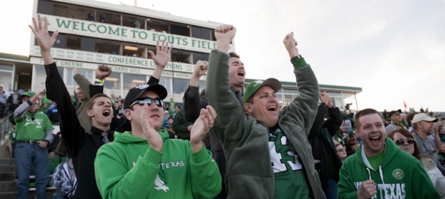
26K at game
not really sure how either team will score this many points...hope the "gate was locked" at this week's practice & we will be..."the most improved team in college football...week 2 "
We are THE "University of NORTH TEXAS"
-
hope so...we need some positivity!
plan to pick up either Taco Cabana breakfast or Rudy's brisket burritos.
looking forward to the game...NT vs SMU games are always entertaining.
It's fun to beat the crap out those daddy's money having...silver spoon eating...spoiled little brats...
#beatSpoiledMuchU
-
Like I said, obsession.
obsession, observations or opinions...however you want to define it...
yes...I have an opinion....my opinion is "we can do better"..."I want our school to be better...that's it..."
...do you want our school to brand like the University of Phoenix? I don't....
good design is good business
-
 1
1
-
-
To Be or Not To Be
In my opinion & observations....I have noticed that the "University of Phoenix" logo looks eerily similar to one of the North Texas logos. It has very stylized bird to the left of a lot of words or letters on the right.
Seeing this....reinforced my thoughts that we need an "additional" mark to help brand our school and separate us from the University of Phoenix, Kaplan University, Western Governors University, Stayer University and any other online university.
Saying more with less is important...or simply "less is more" Having a school mark or brand with less is better. Using less...(i.e.) 1 to 3 letters to brand your school will help raise the perception of your university. Look at our bird/word logo with small font sized letters on a baseball cap, car emblem, a televised yardage/down graphic (see LHN game 8/30) or smart phone scoring app....it's hard to define or read because it does not scale down well.
Studies suggest that good logos:
- need to be simple
- need to be memorable
- need to be "scaleable" (i.e.) work well on a billboard or postage stamp....either way it is clear and easy to read
- need to relevant - does it optimize the industry in question?
In my opinion this means:
- "less is more"...don't "overdesign" it.
- a "memorable design or mark that leaves a big impression"
- simply said...when you shrink designs or words down on a pen, a badge, car emblem, flag, hat, cap, cup or koozie...it is more difficult to read. Is it versatile? BIGGER is better and easier to read.
- what is the perception we are trying to sell...is it appropriate? Who do we want to look like....an "on-line college", an arena football team (i.e. LA KISS) or a "big boy university with an athletic program?" most big time universities have multiple logos to use where best suited.
So....let's spend the time....let's spend the money to do the research and possibly "Expand Our Brand" by adding the "letterman's NT" to some sports related merchandise. "Consumer Choice"...let the consumer choose what they want on a baseball cap, car emblem or BBQ spatula (if you can find one). Who knows...we may get better looking gear, sell more stuff and make more money for our university. It's Free Market Enterprise at work.
Perception is Reality...let's look less like the University of Phoenix and more like the University of North Carolina or the
University of NORTH TEXAS! To be bigger you have to look bigger.
There is no other N&T initials in college football...it's unique, symmetrical, collegiate and ours...let's use it.
Question is...."to be...or not to be" ....who do we want to look like?
Expand the Brand
3XL
-
6
-
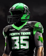
the scale on the eagle was much better than on last years alternate...which was small and looked like a blob of smeared goo.
baby steps...first thing first...and an easy fix...get rid of the ridiculous "horn pants"...they are not helping our mojo or national perception that we have clue of what we're doing...
-
 1
1
-
-
Do you think the SOW is to big on the helmet?
personally I think we have one of the worst D-1 football uniforms and logo in the State of Texas...(the Texas State stylized bobcat and color maroon may suck more...not sure at this point). Goodgodalmighty we look like freaking armature hour out there.
we have:
- those stupid horn stripe pants
- goofy mechanical eagle logo
- mis-matched greens....why can't the green be the same as the cool Nike green on the gloves, warm-ups and coach shirts
- goofy & dated white face mask, socks & shoes
Who freaking signs off on this crap...anyone else sick of us looking silly? The suspossed 2015 new unis can't come quick enough....I hope the AD doesn't screw this up...it's a big part of recruiting, marketing and economics these days.
I'm ready to look mean & green....anybody see BAYLOR last night? Even the dorky Baptist people know how to properly dress their football team for battle!
-
8
-
-
if we play them...then yes...get top dollar....
what's the "gate only" money at UT? 8 million? they can can afford $1M
-
that was ugly last night...I blame our "pants" !
-
2
-
-
these look great...hope we send those nice new unis back to Dallas with a big fat Loss.
-
3
-
-
not really...many refer to the University of North Texas as simply "North Texas" similar to "Notre Dame" or "North Carolina" ...I personally never say U.N.T.....where as many will say T.C.U. or S.M.U.Notre Dame is similar in name to North Texas? Nice reach.
Love our eagle.
a bigger reach would be if I said our academics or football traditition are similar to Norte Dame...
agree...love our eagle, our unique nick name "mean green" , North Texas and love the letterman NT....
N & T are two of the most constant initials associated with our school and its assorted school names over its 100 year history. I say use them all...why not...they are all unique tools "in a branding tool bag" that would be used for specific jobs....that's all.
why not have wider assortment of marks or "tools" to help brand our beloved university...
Expand the Brand
-
1
-
1
-
-
thought this was a short but interesting branding article...
Notre Dame, which is similar in name to North Texas, has decided to switch from grass to "field-turf" in the 2014 season.
"The interlocking ND is the most recognized symbol of our University and its athletics programs, and we wanted to communicate that to our fans and all those viewing our home games on NBC," said Notre Dame athletic director...
I have personally watched a game "live at South Bend" and am disappointed that ND is moving to field-turf...they are one of the few storied programs in college football that should be playing on real grass. I am sure that there are many reasons why they switched...speed...maintenance...water...cost...coach...etc
The first game with their new field-turf and the interlocked ND on the fifty is August 30th vs C-USA's Rice Owls
Expand the Brand
#BeatTexas2014
3XL
-
1
-
1
-
-
wow...terrific looking helmet...a 4 year program that obliviously understands the power of good design.
while we're still stuck with our mojo killing goofy horn stripe pants, mint green helmets with 1980's white facemask, shoes & socks
-
Oh. And, also, f*ck Baylor anyway.
once again I totally agree with TFLF
I had a few thoughts...but that pretty much summed it up for me....
-
I'm ready for NT to have a secondary ticket market...
#BeatTexas2014
-
It totally fits how garish LA can be. I think these are pretty slick, but not something that needs to overshadow their usual uniforms.
Also - that's a Revo Speed helmet. Our guys have them, but not with that OL-style mask.
agreed they're way wild and kinda cool for a game or two...I personally have always loved their traditional powder blue & gold unis.
UCLA is another example of a big time P5 school drawing outside the lines and expanding their recruiting reach. Like it or not...uniforms matter and are definately part of the recruiting equation. It is....Free Market Enterprise...at work.
#BEATTEXAS2014 & SMU
-
totally agree that Alabama, Notre Dame, Nebraska, Michigan, OU, Ohio State, SoCal, Texas & Penn State all have great traditional uniforms and do not need to improve much of anything...but people, fashion and equipment do evolve over time...I would add Nebraska, Ohio State, and Notre Dame.
out of the 9 schools listed above...5 of them are currently doing an alternate for recruiting appeal. "ND, Nebraska, Michigan, Oklahoma & OSU)
I just would like for North Texas to evolve from our 1980's look..."mint green helmet, white facemask, white socks, white shoes & 90's horn stripe" to something a little more current.
"expand the brand" & let's look more "Mean Green"
3XL
-
Weird, the OU logo is still the same. I thought you needed to change that every other year. Oh well.
nope...never said that...no need to fix what's not broken. Now "our helmets" they could use some help.
-
3
-
-
agreed not great....
I do like some of the elements but the wood grain red helmets are a little much...
if you watched the "players reaction" video on the link...they were digging it.
I wish we could improve on our flat "toothpaste mint green helmets with 80's white facemask", 80's shoes and socks and our mojo killing horn stripe pants...those are truly "bad".
We need a lil more kick ass "Mean Green" for our helmets....
#BeatTexas2014
-
3
-
-
http://www.soonersports.com/SportSelect.dbml?SPID=127245&SPSID=750323
WARNING: for those who care nothing about uniforms, design, recruiting, branding & free market enterprise...please move along...
...Sooners will "Bring The Wood" in 2014 with a couple of alternate uniforms. Similar to Norte Dame's Annual Shamrock Series alternate uniforms. Apparently even traditional and storied programs see an "opportunity" to expand their brand and recruiting reach. Like it or not uniforms are "part" of the equation for some recruits and fans.
3XL
-
1
-
1
-
-
Or got tired of losing to them
touché....
still not ideal for our regional college landscape....if you're a fan of great annual games ie Oklahoma vs Nebraska...Texas vs A&M.
Colorado, Missouri and Arkansas have all had great teams at different eras and have history with the current B12 teams.
I can't get excited about BYU
-
Big12 needs bigger State Universities...sucks that (Arkansas SWC), Colorado, Nebraska, Missouri & A&M all got tired of Texas's BS.
-
3
-
1
-
-
I'm constantly amazed by our inability to create a uniform combo that actually looks good. North Texas has a great Communication Design program, yet we can't seem to ever get it right. I'm trying not to complain over a crinkled $20 bill, but I can't take it anymore. The SOW on the helmets doesn't fit correctly. The standard proportions of the eagle don't work on a helmet....at all. Please lets hire a professional to design us uniforms or hire a comm design student that would do a better job.
totally agree with cdizzle86...."it doesn't fit correctly"
-
-
It's technically a violation of intellectual property rights if they are indeed counterfeit Nike merchandise. Wrong color too. More importantly, are they trying to attract gweedo chicks from Jersey?
totally agree....who the heck signed off on this crap? it looks so gweedo....so skankyskanksville
-
2
-
1
-
UTSA Zona Game Thread
in Mean Green Football
Posted
I always want our conference to win OOC.
stronger conference is better...