
3XL
-
Posts
453 -
Joined
-
Last visited
-
Points
90 [ Donate ]
Content Type
Profiles
Forums
Gallery
GoMeanGreen.com
Posts posted by 3XL
-
-
The fewer logos you have the easier it is to not get people confused on who you are. If you need more than 1 logo to identify who you are, you are going to have some huge identity problems. I still see some internet sites still using logos that the school used back in the 90s.
....most large universities have a variety of logos. The variety allows for the appropriate brand for a specific use.
(i.e.) The newest Oklahoma State University brand identity sheet has over 6 unique logos to use were they see fit.
*as far as internet sites still using outdated logos....sounds like they need a new Nick Burns.
-
 2
2
-
-
DT90 is correct...#1 Texas & #12 "12th Man-Land"
-
What items would you like to sell? What items would you need for growth?
Do you want North Texas Athletics to be bigger and sell more merchandise?
Yes...winning helps, but North Texas Athletics could brand & market itself a little better by adding "one" additional logo.
Perception is reality. If it looks better...it will sell better. This is about "sports pride" and better tailgate gear...flags, car emblems & clothing.
Attached is an example of "How-To-Do-It 101". The attachment has random merchandise & logo use by two of the best in the business.
That's right...I said "business". I hope that North Texas is not allergic to money. I primarily featured both North Carolina & Notre Dame because:
1) They are both in the "Top 10" for collegiate merchandising.
2) Both are "similar in name" to North Texas.
- replace words "Fightin' Irish", "Irish" or "Tar Heels" with "Mean Green"
- replace image of "leprechaun", "clover", "foot" or "ram" with our eagle
- replace logo of "ND" or "NC" with our letterman's "NT"
Out of the top 75 schools in merchandise sales, (Notre Dame ranks #3) & (North Carolina ranks #9).
I think we could learn something about marketing from these two schools.
Yes, they are both P5, but look at the way they use their NC & ND logos in merchandising. Out of the top 75 universities listed, over 90% use some form of a 1-2 letter initial or lettered logo in their brand management.
Maybe you don't want a baseball cap with a diving eagle on it or a "green light to greatness" koozie.
North Texas did not crack the top 75...but look who did. #54 East Carolina, #63 South Florida, #66 Memphis, #68 Texas State, #70 Louisiana Lafayette, #71 Colorado State & #72 Marshall.
The big-dog top 25 universities get it. They understand the power of simple & sound collegiate design.
What are we missing? What do they know that we don't? What are they doing that we're not?
Marketing to your target audience, branding your institution, recruiting young people & new fans are all part of the equation. NT has been branding better the last few years, but it's time to turn another corner.
Bottom line...big picture...it's about more money & respect for our university.
Good Design is Good Business.
3XL
-
3
-
1) that 4th quarter at the HOD was incredible
new years day...watching our team win...at the historic Cotton Bowl...was so much fun!
2) the "Stand" against a salty Rice team
-
sports cry....
thank you for the post RETSO....I spent a little time searching the web...the week after the national championship game...looking for a North Texas ranking. I didn't find anything beyond the top 25....but #33...how cool is that!?!
go Mean Green...
-
Scrappy, homeless?
no...not homeless...but there are rumors that he is using...
-
2
-
-
really?!?
...this is a terrific looking bridge. It is well designed and very low maintenance.
Question: Should we paint all the cement on Apogee "green" just because we can see it from the highway?
Answer: no (a little ambient green lighting on bridge...maybe...but paint no)
besides...we have bigger issues...Scrappy really needs our help...he's in a dark period.
-
1
-
 1
1
-
-
He's sCRAPPY.
agreed...he's not cuddly or cool like most mascots...he is pretty creepy.
put me down for $40 on the scrappy re-hab fund...
-
There are some great post here...I really enjoyed Plum & UNTFan23's duel....both good...both funny...I + arrowed both guys!Good Post.
As someone that has been to many Rice games over the years I can tell you that the vast open spaces just kills the college football environment. What looks like a good crowd in Apogee would be swallowed up by Rice stadium. Apogee needs to stay at 30k until tickets are a hard fought commodity for at least half the games in a season.
It's pretty exciting that we can envision, a little more clearly, what this place could be like in 10-20 years.
I agree with HoustonEagle....open spaces can really kill the football environment...let's max what we have first....
-
2
-
-
well done cdizzle86....
I like those matte helmets. Most everyone knows that I am not a fan of our mechanical diving eagle...but your helmets are "way cool" and that's by far the best sow alternate to date...digging the grey on matte black. Your scaling and layout are very well done.
...give us this as an alternate to....the spelled North Texas, a black sow on a toothpaste green helmet with white facemask or an "aqua" sow on black helmet.
The "Oregon" oversized bird wing on helmet has really been a little overdone. IMO I thought that Rice's bowl wing helmet was trying too hard and not all that great....BUT these are really way cool...
I envision the "classic & collegiate" interlocked NT as our everyday home & away helmet...it's timeless...and...then these "kickass" helmets for our "Special Big Game" uniforms. This 2 helmet combination would be the perfect 1-2 punch for our AD, team and fans. This combo could very well please a lot of different folks. Love it!!
thanks for sharing your vision!
3XL
-
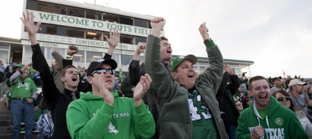
At the half...I left our section 25 and walked over to press box side for a quick look.
While walking...I was overcome with pride seeing the amount of happy people all wearing green.
What a season....hope we get more of these good feelings.
Hats of to Mac...the coaches...& team.
It will be a sold out Apogee vs the lil' ponies...I'd loved to send their fans back to Dallas with a big fat loss.
Great Day to be Mean Green!
3XL
-
totally agree...the wave is soooo tired. The Rangers are just in discouraging it....who do you want to distract more...your hitter or your pitcher.I hate the wave.
Not sure how you can ban the wave, but I know the Texas Rangers discourage it with tounge-n-cheek video displays
-
Ya, definitely a segment for gay, not gay.
I think we all know what the ruling would.be.
agreed this can all be comical at times....and that's a funny "bit" on the Ticket.
to all the "macho men" with the "who gives a crap about logos comments" & those who post "silly videos" should care...
because bottom line...big picture....it's about more money & respect for our university.
You want North Texas "athletics" to be bigger? We'll need to brand and market ourselves bigger.
To me...this is less of a "bit" and more about economics 101.
-
1
-
-
Where the interlocking letters that the Letterman's association has for its logo stops dead in its tracks is that it is not an official (or rather -- approved) logo of the school. It will likely never be if URCM has its way. Should an interlocking NT ever be created it will use the current font that is being use like in the UNT.edu splash page:

UNTFan23 sure likes the words never and ever...
I can just imagine if the design ideas were left up to guys like UNTFan23.
Hey...UNTFan23 question:
"What logo should we put on our new baseball team's ball cap?"
answer - you "never-ever" wanting to paint outside the lines or push for change may reply...."uhhhh I don't know....how bout spelling out North Texas in our special font plus have our mechanical diving eagle beside it"
-
2
-
-
Considering since I have went to NT, I have seen three different logos/brands be rolled out. I would prefer to keep what we have going for at least another decade or so before it gets freshened up to whatever seems hip at the time.
you are missing the point...
I think most everyone is pretty happy with the university's current branding efforts.
This is not about a total re-brand or wholesale change to our current brand management....it's about adding our Letterman's interlocked NT as an additional mark. This NT mark would be used primarily in athletics.
...interlocked letters are not "hip at the time" they are classic & collegiate....ours happens to be unique & balanced.
-
2
-
-
I love it when the puffed up so called X&O guy reads every post on a uni thread and then contributes to it...A bunch of goll dern wimmin talking about clothing for men playing a violent game. Worrying about " accent" colors and "branding" and "logos" like it makes a difference when a 305 pound defensive lineman meets a 195 pound back carrying the pigskin. "I just love how the green in your jersey brings out the green in your eyes" said the lineman. To which the ball carrier replied "that logo on your helmet is so tastefully accented in sky blue".
marketing to your target audience, branding your institution & recruiting young people are all part of the equation....
good design is good business
-
5
-
-
and he had to have "North Texas" on the side of the phone.
greatness! that was funny!
-
1
-
-
...maybe NT with the SOW.
no to "layered logos"...that would be poor design.
keep it classic, "cool" & collegiate
-
bstnsportsfan3 regarding the "Boise Rule"
I think the final ruling was that Boise could wear their "all blues".
If not, we have options.
-
Merry Christmas from where the west begins...Fort Worth, Texas
Wishing all GMG'ers a Happy New Year!
HOD here we come!!!!
-
1
-
-
little college football humor...my attempt to lighten the mood from meangreener's "an eagle dies" post....
War Eagle! Auburn (Tiger & Eagle) = North Texas (Mean Green & Eagle)
"THE" University of North Texas = play on "THE" Ohio State University
-
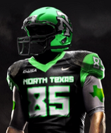
The biggest constraint with helmets is the cost. ($30K+ to outfit the team)I really liked the matte black that Baylor wore vs. Oklahoma (Baylor went insane in 2013 with the amount of cash spent on helmets $200K+)I also love the shinny purple chrome that TCU wears 2-3 times a year. (people here in Fort Worth call them Bass Boat Purple).Cost is a constraint but would really like to see NT have a 2nd option in matte black or shinny Bass Boat Green. See attached photo & think Mean Green. (if Bass Boat Chrome is too shinny for you...look at step down glossy i.e. Oklahoma helmet & think Mean Green)Our current helmet is kind of a flat mint green...we need a little Mojo Green!War Eagle!"THE" University of North Texas3XL
-
1
-
-
uniforms help with mojo...
-
2
-
-
thanks FFR...my apologies for posting this yahoo article. I had not read before last night and it was new to me.
changing gears....our crew is way excited about the HOD in the Cotton Bowl. As of last night we have 55 "confirmed" tickets bought via the NT office.
GMG!
3XL
-
1
-
If you owned the Mean Green spirit store
in Mean Green Football
Posted
ding ding ding....thank you captain obvious
Let's see how can I explain it any clearer or in terms that you will understand.
(ie) let's say that UNT's current Brand Idenity Sheet is "Windows 8"....it's time to update, improve, modify & download....to "Windows 9"...still similar to "Windows 8" but different & little better...
Mean Green 93-98 said it best...please see his post