Search the Community
Showing results for tags 'branding & marketing'.
-
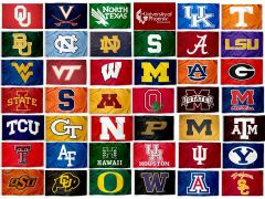
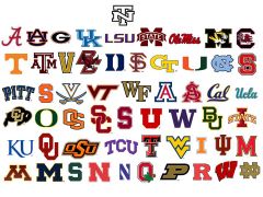
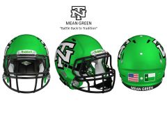
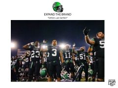
To Be or Not To Be In my opinion & observations....I have noticed that the "University of Phoenix" logo looks eerily similar to one of the North Texas logos. It has very stylized bird to the left of a lot of words or letters on the right. Seeing this....reinforced my thoughts that we need an "additional" mark to help brand our school and separate us from the University of Phoenix, Kaplan University, Western Governors University, Stayer University and any other online university. Saying more with less is important...or simply "less is more" Having a school mark or brand with less is better. Using less...(i.e.) 1 to 3 letters to brand your school will help raise the perception of your university. Look at our bird/word logo with small font sized letters on a baseball cap, car emblem, a televised yardage/down graphic (see LHN game 8/30) or smart phone scoring app....it's hard to define or read because it does not scale down well. Studies suggest that good logos: need to be simple need to be memorable need to be "scaleable" (i.e.) work well on a billboard or postage stamp....either way it is clear and easy to read need to relevant - does it optimize the industry in question? In my opinion this means: "less is more"...don't "overdesign" it. a "memorable design or mark that leaves a big impression" simply said...when you shrink designs or words down on a pen, a badge, car emblem, flag, hat, cap, cup or koozie...it is more difficult to read. Is it versatile? BIGGER is better and easier to read. what is the perception we are trying to sell...is it appropriate? Who do we want to look like....an "on-line college", an arena football team (i.e. LA KISS) or a "big boy university with an athletic program?" most big time universities have multiple logos to use where best suited. So....let's spend the time....let's spend the money to do the research and possibly "Expand Our Brand" by adding the "letterman's NT" to some sports related merchandise. "Consumer Choice"...let the consumer choose what they want on a baseball cap, car emblem or BBQ spatula (if you can find one). Who knows...we may get better looking gear, sell more stuff and make more money for our university. It's Free Market Enterprise at work. Perception is Reality...let's look less like the University of Phoenix and more like the University of North Carolina or the University of NORTH TEXAS! To be bigger you have to look bigger. There is no other N&T initials in college football...it's unique, symmetrical, collegiate and ours...let's use it. Question is...."to be...or not to be" ....who do we want to look like? Expand the Brand 3XL
-
From the album: college uni
question is...."to be or not to be" -
From the album: 3XL Mean Green
© 3XL Design
-
From the album: 3XL Mean Green
© 3XL Design
-
From the album: 3XL Mean Green
© 3XL Design

