-
Posts
1,012 -
Joined
-
Last visited
-
Points
20 [ Donate ]
Content Type
Profiles
Forums
Gallery
GoMeanGreen.com
Posts posted by Bryan316
-
-
Strong showing from our guys the last few days. We shocked the tournament, got revenge 12 years later, and started a rivalry with our future conference bros. If it was up to me, we'd hang a banner for this in the Pit and keep the alum pipeline flowing.
-
 3
3
-
 1
1
-
 1
1
-
-
Pair them with the throwback pants and it'll be perfect.
-
 1
1
-
-
The only permanent solution for textures and patterns is Hydro Graphics, and on a number of their helmets the team logo is a decal. Until/unless we have the funds, Wednesday's carbon fiber wrap on a black shell looked great.
-

One of the first things I noticed after the "Wear Green or Black" slide. They made one of the team pics black/white, but kept the green helmets and the green in Coach Mac's shirt. I'm ok with the black jerseys, since they'll be legit this time. I hope they go with the white pants, but our green is light enough that the green pants could work.
-
Strange. I have it set to record on two channels and it didn't. Is there a replay somewhere?
http://www.meangreensports.com/beyondthegreen/ has parts one and two of the fourth episode.
-
Keep the classic throwback template, update the green to kelly green, put "Mean Green" on the front of the home jersey and "North Texas" on the away (like baseball does), add shoulder numbers and names, and slap the diving eagle on the helmet. Have a white and green helmet for variety, but only white pants. Then leave it alone.
-
Something tells me that with how bland our current uniforms are, I'll wish this mashup uniform was our regular one.
-
 2
2
-
-
All I'd like are uniforms that are closer to the basketball green (but not shiny, obvs), outline the numbers in black, white ringer cuffs on the green jersey to match the green ringer cuffs on the white jersey, and either use a white SoW outlined in black on the helmet, or put it on the jersey sleeve facing forward. Basically, steal Marshall's jersey templates (and possibly their green).
Oh, and a State of Texas outline sticker on the back of the helmet with a SoW or star centered over Denton, like UT and SMU have (can't tell if it's a logo or a dot or star or what), or a white Texas with a UNT wordmark inside like A&M has a maroon state with a white aTm logo inside.
-
 1
1
-
-
So far today, I'd rather have Jonathan Moxon after the strip club bender back there.
-
 2
2
-
-
http://cowboyszone.com/forums/showthread.php?t=235689
They've been following the Cowboys FA signings. Looks like Darrell Scott's the only other FA RB so far. He sounds more like a blocking/pounding guy, as opposed to the quickness and agility that Lance has.
-
 1
1
-
-
I'm pretty sure they had the same setup last year.
-
-
One of the homeland security grants I help coordinate went into paying for some of those security features.
-
Don't kick yourself just yet; the feed still isn't available.
-
They're not assigned. Just like at Fouts, they show up early enough to stake their claim.It's baffling to me that anyone would get assigned seats. Students who are motivated enough to get there early should be rewarded.
-
 2
2
-
-
As much as I've hated on our new uniforms*, the green/white combo was sharp. Under our lights, the green looks really nice. Even though the team captains choose the uni for the week, I'm voting for this combo as the main home uniform and last week's white/green as the main away combo.
Also, Jim Vilk over on UniWatch selected last week's Alabama/NT game #1 in his 5/1 uni match-up recap. Reading today's comments, he probably would have chosen yesterday's IU/NT game if he saw a photo before submitting this weeks.
*We still need a black outline around the helmet wordmark and numbers, and white SoWs on the sleeves.
-
 1
1
-
-
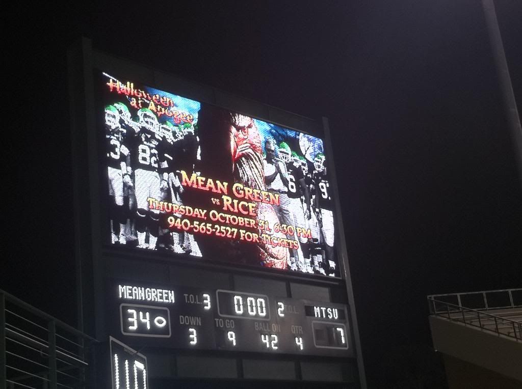
I couldn't tell due to all of my bouncing around, but did the players touch the eagle statue when they came onto the field.
Short answer: Yes.
Long answer:
-
Since we went simple, we should have gone with Marshall's jersey template.
-
I think it is. At least as much as I have seen, helmet and all, it looks to be to me.
What was that official shade the URCM department listed it to be, Pantone # 3TexasHighwayExitSign42?
Rick
-
Sadly, these are very plain. Too plain to even be called "classic." When I heard we were going "classic," I didn't like it, since we had finally crossed the modern uniform design threshold, but I had a few "classic" designs I'd be cool with: Abner Haynes-era shoulder stripes or Steve Ramsey/Joe Greene/U of Florida triple stripes on the sleeves. Even the new basic Baylor jerseys with Nike's odd wing-shaped shoulder stitching pattern would have worked. Instead, we get the least-expensive, most poor-inner-city-school-district template known to man. The cuffs aren't a contrasting color, the numbers aren't outlined in black for visibility's sake, and we can't even slap the SoW on the sleeve for TV or photos to create that brand recognition we so desire (and need). They didn't even use the unique athletic number font that was designed back in 2004 or 2005 and used on the 05-06 jerseys. There's zero personality here. Authentic jerseys won't cost the normal $120+, they'll cost $40 and about 5 minutes with a sewing machine.
And that lack of personality continues in the helmet that also has no outline to make the words stand out. Scoring an authentic helmet for your NT Room won't be a feat, since you can make one yourself with a can of too-light green paint, a basic stencil, and a can of white Krylon.
Seriously, these don't say "old school trench warfare" football, they scream "boring, bland" football, regardless of how we actually play. When thousands see our highlights on TV, they'll joke that we spent all our money on the stadium and didn't have enough left for decent uniforms.
-
 3
3
-
 10
10
-
-
They have it mounted with the base askew and the head facing forward. I thought the plan was for it to be staring towards the visitor's bench in a menacing way.
-
Are the two buildings under the wing zone consession stands? It looks like the one on the east side may be accessible from outside the stadium before games? A little help here.
If you're talking about the one in photo 0347 on the left side of the Wingzone, that's a ticket booth. You can see the bottom edge of the glowing "Tickets" sign like the student side ticket booth next to the circle drive.
-
 1
1
-
-
boring. simple uniforms are boring, yes, boring.
i liked our recent uniforms except for the helmets and no logo. give me a boise or tcu uniform. aka alabama is cheap looking crap.
This. The UA uniforms finally brought us into the modern era of piping and stripes instead of our bland New Balance ringer t's. I thought with the Nike switch we'd keep it going. And going with uniforms that are just solid numbers with no outline and no sleeve stripes looks cheap as hell.
-
 3
3
-
 1
1
-
-
Talking with Coach McCarney at the Plano Coaches Caravan... he mentioned that the team will be in new helmets next year... GREEN helmets. No mention of the logo/graphic/wording on the side of the helmet though.
The helmet mentioned in the photo looks to be GREEN, wit ha white face mask and a single black stripe down the middle.
In the NBC article/vid, at 0:47-0:48 there's a flat green helmet, black facemask with black/white/black stripes and "North Texas" on the side, which we never wore. Might just be another prototype someone stuck on the wall. But with Joe Greene shining up the white facemask version while being filmed, I'm thinking that's the one for Sept. 3.


Dave Campbell's Football Magazine 2022
in Mean Green Football
Posted
That's a milquetoast prediction. We'll be perfectly balanced, losing to the six good teams and beating the six bad teams. At least it pins to a bulletin board well.