Jump to content

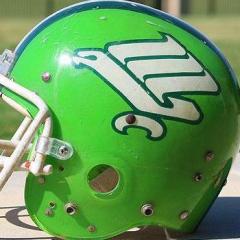
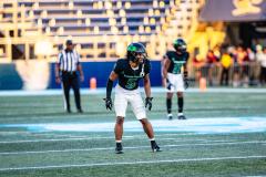
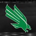
UNT’s helmet for the 2014 season finalized


Harry

Recommended Posts

SOW was originally hated by just about anyone, but it has grown on people.

I only remember a small group hating it because it wasn't an interlocked NT. For whatever reason, that group was passionate about having that as our logo. I still remember seeing the vid of ****** and *** at the branding unveiling, acting absolutely disgusted and childish for not getting it.

(*'s to protect the innocent)

Link to comment
Share on other sites

I only remember a small group hating it because it wasn't an interlocked NT. For whatever reason, that group was passionate about having that as our logo. I still remember seeing the vid of ****** and *** at the branding unveiling, acting absolutely disgusted and childish for not getting it.

(*'s to protect the innocent)

Hated by some. Big MEH from most. I was in the later group. It has grown on me and I think a lot of others.

Link to comment
Share on other sites

Hated by some. Big MEH from most. I was in the later group. It has grown on me and I think a lot of others.

You forgot the people who loved it....it was a small group (at least on the board), but I was in that minority.

I think originally there was confusion b/c they released the big SOW, and the mini-eagle head postal service logo at the same time. I think most liked the SOW, but gave the entire unveiling a 'meh' because they were worried we'd use the postal service logo more prominently.

*edit: now that I think more on it---we released the WORD Marks, SOW, postal service eagle and a slew of other things all at once. So---the unveiling was botched simply b/c they put out way too much stuff. Thankfully, over time the university and AD have consolidated down to using the SOW most prominently....

Edited by TIgreen01
Link to comment
Share on other sites

  • 4 weeks later...

Hated by some. Big MEH from most. I was in the later group. It has grown on me and I think a lot of others.

big meh from most kinda says a lot...unfortunately...we missed the mark with the bird/word logo...

we were denied our chance to be "Texas State " however many years ago...so the N & T makes more sense, has more history, ties the old with the new and looks more collegiant. We're lucky that NT is symmetrical, unique and looks great. Too bad we chose to look more postal and on-line college...huge opportunity for the next batch of decision makers or AD.

for now we'll just have to settle for being the "meh green"

Edited by 3XL
  • Upvote 1
  • Downvote 5
Link to comment
Share on other sites

we were denied our chance to be "Texas State " however many years ago...

I don't think that's correct. We were denied our chance to be UNT in 1961 due to UT alumni in the legislature, and had to settle for NTSU. In 1988, I believe we chose UNT since that is what had always been desired, although we were offered that we could drop "North" and become TSU.

Others who know more can confirm or correct this.

I, for one, am glad that we didn't stop being "North Texas".

I also have heard that for a long time "Texas State" was reserved for A&M, as other states A&Ms had changed their name to "State" (i.e. OK State), and it was thought that the Aggies might want to do likewise.

Link to comment
Share on other sites

big meh from most kinda says a lot...unfortunately...we missed the mark with the bird/word logo...

we were denied our chance to be "Texas State " however many years ago...so the N & T makes more sense, has more history, ties the old with the new and looks more collegiant. We're lucky that NT is symmetrical, unique and looks great. Too bad we chose to look more postal and on-line college...huge opportunity for the next batch of decision makers or AD.

for now we'll just have to settle for being the "meh green"

gag.gif

Link to comment
Share on other sites

I don't think that's correct. We were denied our chance to be UNT in 1961 due to UT alumni in the legislature, and had to settle for NTSU. In 1988, I believe we chose UNT since that is what had always been desired, although we were offered that we could drop "North" and become TSU.

However, this required an additional change to become the "Armadillos", so we decided against it.

  • Upvote 1
Link to comment
Share on other sites

big meh from most kinda says a lot...unfortunately...we missed the mark with the bird/word logo...

we were denied our chance to be "Texas State " however many years ago...so the N & T makes more sense, has more history, ties the old with the new and looks more collegiant. We're lucky that NT is symmetrical, unique and looks great. Too bad we chose to look more postal and on-line college...huge opportunity for the next batch of decision makers or AD.

for now we'll just have to settle for being the "meh green"

Big "meh" from you because your designs/suggestions were not used? I like our helmets. Edited by UNTLifer
  • Upvote 3
  • Downvote 1
Link to comment
Share on other sites

Big "meh" from you because your designs/suggestions eere not used? I like our helmets.

I didn't design the letterman's logo...it's just an appropriate look for any university with an athletic program...that's it.

I never said kill the bird...I just think...NT & Mean Green are better and that we seriously need to add an "additional logo" for sports...it's about perception & economics. You have to look like a big boy university to be one...

I don't know why you're defending a lesser logo for our school...maybe you work for the post office, were on the design committee that approved it or received a degree from the University of Phoenix...whatever...

jus saying...we could do better.

Edited by 3XL
  • Upvote 1
  • Downvote 4
Link to comment
Share on other sites

I love the diving eagle, looks very collegiate to me in the way that the mustang, longhorn, razorback, etc are. Keep it for 50 years.

agree...the longhorn, razorback and mustang are all terrific marks...but our eagle looks unbalanced & mechanical....plus we want to go by the MEAN GREEN.

...North Texas is better suited for the interlocked letters...ie North Carolina's NC, Notre Dame's ND or

Texas Tech's double T

  • Downvote 5
Link to comment
Share on other sites

agree...the longhorn, razorback and mustang are all terrific marks...but our eagle looks unbalanced & mechanical....plus we want to go by the MEAN GREEN.

...North Texas is better suited for the interlocked letters...ie North Carolina's NC, Notre Dame's ND or

Texas Tech's double T

You are both wrong and false... I'd say like 60% wrong and 40% false.

100% incorrect.

  • Upvote 3
  • Downvote 1
Link to comment
Share on other sites

I didn't design the letterman's logo...it's just an appropriate look for any university with an athletic program...that's it.

I never said kill the bird...I just think...NT & Mean Green are better and that we seriously need to add an "additional logo" for sports...it's about perception & economics. You have to look like a big boy university to be one...

I don't know why you're defending a lesser logo for our school...maybe you work for the post office, were on the design committee that approved it or received a degree from the University of Phoenix...whatever...

jus saying...we could do better.

So you are upset they have ignored your designs. You've proven this by backing up your statements with nothing but opinions. This has nothing to do with perception or economics. I'm not defending a lesser logo, again, your opinion, just glad they put our logo on the helmet.

Oh, and a no to all your other questions/statements/smart assed remarks about me. I am just an alum and lifelong fan that likes this logo and the original stylized eagle and am glad North Texas is off our helmets. Scrappy sure seems to be popular representing an eagle. I do not want a mascot that is a green version of WKU's.

  • Downvote 1
Link to comment
Share on other sites

Join the conversation

You can post now and register later. If you have an account, sign in now to post with your account.
Note: Your post will require moderator approval before it will be visible.

Guest
Reply to this topic...

×   Pasted as rich text.   Paste as plain text instead

  Only 75 emoji are allowed.

×   Your link has been automatically embedded.   Display as a link instead

×   Your previous content has been restored.   Clear editor

×   You cannot paste images directly. Upload or insert images from URL.


  • Tell a friend

    Love GoMeanGreen.com? Tell a friend!
  • What's going on Mean Green?

    1. 29

      The Athletic on DFW Football recruiting

    2. 30

      Spring transfer portal

    3. 30

      Spring transfer portal

    4. 29

      The Athletic on DFW Football recruiting

    5. 21

      SWAC leading rebounder Brian Myles to announce where he's going

  • Popular Now

  • Popular Contributors

  • Member Statistics

    • Total Members
      15,382
    • Most Online
      1,865

    Newest Member
    KeithSHU
    Joined
×
×
  • Create New...

Important Information

We have placed cookies on your device to help make this website better. You can adjust your cookie settings, otherwise we'll assume you're okay to continue. Please review our full Privacy Policy before using our site.