

UNTFan23
-
Posts
10,999 -
Joined
-
Days Won
17 -
Points
9,910 [ Donate ]
Content Type
Profiles
Forums
Gallery
GoMeanGreen.com
Image Comments posted by UNTFan23
-
-
Haha, I work in a company where change is constant. I also have a business degree and have a decent understanding if marketing. My brother, who is a marketing major, and I always enjoy some of the stuff that gets discussed on here and how it goes against what is the best course of action to take for stuff like this.
I guess if pushing for North Texas to join the throngs of schools that want to use letters to represent their "brand" helps keep you engaged with the university then so be it.
-
...this isn't about reinventing the wheel...this is about a +1 ADDITIONAL letter logo to our current brand assortment.
letters are better for college
Why add something when the fonts between the two look nothing alike.

compared to

If the two different word marks/logos were using the same font I'd be more open to your suggestion however what you want goes against the guidelines laid out by UCRM.
-
Question: How well has going against the football college trends and traditions worked the last 100 years for North Texas?
...
I don't want North Texas to lose their identity....I just want North Texas to look more collegiate.
What separates North Texas from a lot of other schools is we keep changing our minds on what we want to have represent the "North Texas" brand. Are we gonna use alphabet soup, the whole name of "North Texas," or are we going to use an eagle?
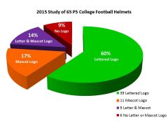
Since as far back as late 1960s we have used 10 different logos/brands/whatever you want to call it. Seriously, go to the helmet project and count the variations of NT, an eagle, and/or "North Texas" we have used on our helmets. Your logo/brand would just be yet another (#11!!!) in a long line of logos/brands that have been used to represent a very fractured history of the North Texas brand.
It took several years before we saw the current logo being used almost everywhere. We still have some people still using the old "circle-star" logo from time to time. If we changed to another logo I'd expect the same amount of transition time. We need to find a logo and then stick with it for several decades.
Our current stuff is fine, no need to reinvent the wheel again.
-
I just love the ambiguity of terms like "that's so high school" and "it's more collegiate." There really is no barometer to establish what is of a high school, college, or pro level when it comes to logos, uniforms, helmet stickers, etc. It's all personal preferences and opinions.
Even if we were to adopt this logo/word mark it would only have a shelf life of about 10 years as that seems to be norm for North Texas. If you look at the helmet project site for our school, we constantly cycle through logos because we can never find something and the commit to it until the end of time.
-
So we should be like everyone else? That'll sure make unique, won't it? Part of good brand identity is setting yourself away from the pack. Putting some letters on a helmet gets us in the pack of alphabet soup universities.
-
SMU is not in a P5 conference.
-
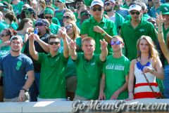
The woman on the right doesn't seem as happy as all the people clad in green. Oh well, can't please them all.
-
It's interesting you mention demand. Do we even know what the demand is for the blocked "NT" logo/wordmark? Has any marketing research been done to see which potential buyers might prefer? Polling gomeangreen.com is very unscientific in my opinion. Due diligence would require several focus groups to be formed by an unbiased group to come to a proper solution. That would cost someone (NT?) several hundred thousand dollars.
Yes, companies go and introduce new or improved products all the time. However they often spend millions of dollars on R&D, focus groups, etc. Where I work (a national retailer), we are rolling out a new private label brand but this has been after we tested in select markets for about half a year before we are rolling it to the chain and this was likely after prior research was done. We test new store formats all the time but on a very small scale and gather lots of market research to back up whether a large scale implementation is the right thing to do.
To just blindly roll out a new logo, which is what you are basically proposing, is a very risky thing to do with costs to be incurred to manufacturers, distributors, and retailers just to provide this new logo along side an established logo. It is the manufacturers, distributors, and retailers that someone will need to convince that there is the demand for a secondary logo.
-
Not afraid to take it to another level at all. I just don't see where there would be enough demand to warrant another logo/wordmark.
You'd have to reduce the current assortment of apparel in order to add in the other logo. In my opinion, depending on how successful that logo is with apparel sales would dictate whether you'd see that logo make it to other things like shot glasses, coffee mugs, golf accessories, etc. It would likely take years to get the new logo to have any significant penetration on store shelves.
The real question is whether the additional logo and loss of the assortment of the already established brand would result in increased revenue. The business major in me says it's an extremely risky proposition given the small customer base we are dealing with.
-
/sigh
We don't need another logo. Since I started college in 1997, I've seen two or three logos come and go. The alumni association has changed its name three times (and each time its logo). It's been nice to see some consistency with our branding for once for the past 6 or 8 years.
We don't need another logo or wordmark. I'm not even sure we have the fan base to really support a secondary logo/wordmark like you want. I would actually be worried about brand confusion given the school's tendency to always be changing things every couple years.
We're not Notre Dame, USC, Texas, etc. We're that under-appreciated teacher's college that doesn't get the respect/support it deserves.
-
If it is a classic collegiate look then why don't you see more schools with interlocked letter logos cause you really don't see it very often.
-
It's also a cheap way to make a logo without accidentally using someone else's stuff. I bet the creative director behind the wardrobe spent all of 30 seconds creating that logo. This scene was Taylor Swift paying homage to Gwen Stefani (Hollaback Girl).
If you want a "timeless look" then how about we use Greek letters? How can you argue with thousands of years of use?
-
That is actually a Cub Scout uniform but I'll let it slide.
-
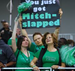
This sign never gets old.

-
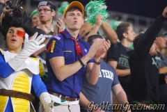
John and Emmitt. Not sure who the person in the middle is.
-
I love downtown Fort Worth.
-
This one can come to every game.

-
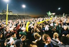
This was by far the best game I have ever gone to at Fouts Field.


new_smoker.jpg
in Mean Green Tailgating
2Posted
Impressive!