3XL
-
Posts
453 -
Joined
-
Last visited
-
Points
90 [ Donate ]
Content Type
Profiles
Forums
Gallery
GoMeanGreen.com
Everything posted by 3XL
-
-
 the dawn of tradition...begins now. Expand the Brand
 -
-
this...I wish there was a +2 option on GMG!
-
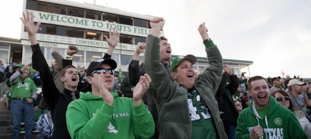
agreed...every time I drive by....I can't decide if the new Sic'em Stadium is better suited as a venue at Opryland USA or at Jim & Tammy Faye's Heritage USA. personally...I am very proud of how well our Appogee Stadium turned out...
-
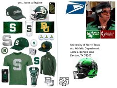
 jquincy...the point is...for our Athletic Dept. to push for an additional NT logo to our current brand assortment. Do we want to look & brand more like P5 school or G5 school? Add the same NT that is used on our letterman jacket. That way North Texas can use it when and where as needed. Question: What logo do the schools, that you listed, put on their baseball team hat? Answer: Texas = T, Florida State = interlocked FS, Southern Cal = interlocked SC, Clemson = C, Michigan State = Spartan Head or S. Ole Miss = M, Florida = F most schools have a good lettered logo...whether its one, two or three letters doesn't matter. Looks more collegiate. expand the brand
 -
right...did you read where I already said that...
-
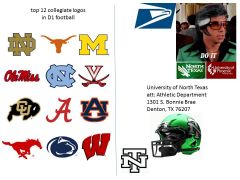
Eagle Mans top 12 collegiate logos are all P5 schools...with one exception to SMU the lone G5. (the church boys in Dallas can thank the Ford men in Detroit for designing their Mustang logo) These logos are simple, balanced and easy to identify. They all have traditional college look and feel. Expand the Brand "Letters are Better" for college
-
From the album: college uni
digital post card -
"they're doing it right" top 12 D1 schools with an interlocked logos
3XL commented on 3XL's gallery image in Members Gallery
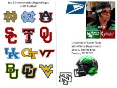 top 12 D1 football schools with interlocked sports logos. (all are also P5 schools) 1. Notre Damn - hands down the king of college football cool & tradition. The Fighting Irish are the undisputed champs of branding & marketing. We should take note of how they use their ND. 2. North Carolina - #2 is no schlump in regards to marketing & branding. NC is similar to North Texas in name...if we could only emulate how well they use all of their logos...the NC, Tarheels, ram & spelled out North Carolina. 3. Auburn - this SEC school uses the symmetrical balanced A & U perfectly...we could do the same with our N & T. 4.Southern California - uses 3 logo approach with trojan head, USC & SC. Uses where each is a best fit and with zero brand confusion. 5. Texas Tech - there is no mistaking when you see the Double T who it belongs to. Looks great on a helmet, flag, letterhead, hat, golf ball or cooler. 6.Oklahoma - college tradition runs deep in the central plains. Their interlocked OU will never go out of style. 7. Kentucky - SEC and national basketball giant...choose to look like a traditional college team with their UK. 8. Georgia Tech - the buzz flying around this ACC school is that they love their GT logo. 9. Virginia Tech - looks like an updated VT from the 80s but still very well designed. 10. Baylor - sic-em & amen...the bears use their classic BU for football helmets, baseball hats, car emblems and flags. 11. Colorado - the Buffs interlocked logo is primarily used with-in the buffalo silhouette. It looks great on all sports or school related merchandise. 12. West Virginia - has a throwback funky 70s Van Halen vibe. Eagle Man says this and the Virginia Tech are his least favorites...but still look kick ass on a helmet and sports gear. Expand the Brand "Letters are Better" for college
 -
"they're doing it right" top 12 D1 schools with an interlocked logos
3XL posted a gallery image in Members Gallery
From the album: college uni
digital postcard -
"they're also doing it wrong" top 12 worst logos
3XL commented on 3XL's gallery image in Members Gallery
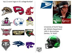 Eagle Mans Top 12 Worst D1 logos 1. Western Michigan - they took the NFLs worst logo/uniform (Denver) and brought to D1 college in brown. 2. Western Kentucky - Hand & Towel...really!?! the only thing missing is the lotion bottle. 3. Washington State - 1 of the 2 P5 logos that made the list...the bigger schools have a much better handle on what looks good. WSU put their initials into a "stylized" cougar head. End Result = a P5 designed mess. 4. New Mexico State - Sun Belts enchanted team with way to much going on...hard to read verbiage and bad design. 5. South Alabama - this logo on their white helmet gets lost...plus looks like the Alien baby popping out of a stomach. 6. East Carolina - good football team...bad logo. There are good ways to have a little pirate thing going and bad ways...they chose poorly and went with the bad High School design. 7. Troy - again too much going on...hard to read and see. also they are stuck with maroon...worst color in sports. 8. Southern Miss - hey...1982 called...it wants its VHS tapes, walk-man and logo back. Their name spelled out eighties style stinks. The only thing that could make this helmet worse is if they chose a 80s white face-mask. 9.UAB - poor UAB...their team is gone and that makes Eagle Man sad...but their logo looked like it belonged in the NFL Europe league. Eagle Man doesn't like dragons in his books, movies, games or football helmets. 10. New Mexico - poorly designed wolf/word logo. Too much going on. Looks like it belongs on the Albuquerque Arena League team helmet. 11. Nevada - yes..good team...but they got way off track designing their crazy wolf head. The stretched out head with internal lightning strikes stink. Extra Penalty for double horn stripes on their pants. 12. Kansas State - Stylized wild cat head...again not Eagle Mans favorite (see #3 and honorable mention Texas State). They do get bonus points for overall good uniform looks...with no horn stripes, black shoes & socks. to sum it all up...the G5 schools need help and the P5 schools "get it". "part of being bigger is looking bigger & better" Expand the Brand "Letters are Better" for college
 -
From the album: college uni
digital post card -
 flying backwards....hope they fix that...looks great otherwise...
 -
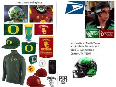
 This weeks digital postcard brought to you by the 2015 AT&T Cotton Bowl Classic, Art Briles & Mark Dantonio. One school is big...the other is small...but these two green teams are mean. They both know how to ball on the field and market off it. Yes...there are Spartans and Bears but not on "everything"...they use multiple logos & marks with zero brand confusion. Eagle Man strongly disapproves of MSUs current horn stripe on their football helmet...says its a goofy & flawed look on a rich traditional STATE of cool. Expand the Brand
 -
From the album: college uni
digital postcard -
The best player(s) to play college football from your high school?
3XL replied to Harry's topic in Mean Green Football
Joe Don Looney- Paschal HS Fort Worth (circa 1960's) college(s)-Texas, TCU, Oklahoma? NFL- Lions, Redskins the "ticket" was talking about his biography a few years back...pretty interesting stuff...I plan to read the book. -
The best player(s) to play college football from your high school?
3XL replied to Harry's topic in Mean Green Football
yes...coyote Joey Aboussie won a state championship at "Old High" in 69-70ish...then...I think played at Texas....and lived across the street from my grandmother! -
The best player(s) to play college football from your high school?
3XL replied to Harry's topic in Mean Green Football
Wichita Falls Rider Raiders- ROHO David Nelson - University of Florida caught TD pass vs Oklahoma in the National Championship game...and as a Buffalo Bill kissed his Dallas Cowboy cheerleader girlfriend. (In Denton...I watched him play/lose in the Rider vs Aledo deep in the playoffs...It was hands down the best highschool game that I have personally watched.) JT Barrett - The "undisputed" Ohio State University Enrolled as OSU freshman in spring of his HS senior year. Replaced injured QB Braxton Miller in 2014. Leads OSU to #5-6 in the nation...until he too is hurt...you know the rest... fun tread... -
exactly...that's the point....I used the shoe company analogy to debunk both of your ("you can't out brand something" & "brand equity" ) statements. We are selling a product/brand here at UNT...college football is a business. To help sell our product...we need to do a better job. At this point (four years into their football program) USTA is the Nike/Under Armor...whatever (fill-in the blank business)...and doing a better job than us... I have to admit...that I am little envious of UTSA's vision, efforts & commitment in regards to athletics.
-
this is the football forum... Adidas ($14Billion) founded 1920's and Nike ($23Billion) founded 1970's...so what? please ask Phil Knight how to out-brand the competition? He beat them...at their game...at most every level....including "branding"
-
 This week's digital postcard brought to you by the PAC12 & Phil Knight. I'm pretty sure Nike, uncle Phil and the PAC12 know how to "brand". Eagle Man says...we need to step it up...and start to out-brand, out-recruit, out-play, out-everything the CUSA competition. perception is reality... Expand the Brand
 -
From the album: college uni
digital postcard -
brand /brand/ verb to produce a vivid impression Synonyms BRAND, ETCH, IMPRESS, IMPRINT, INFIX, INGRAIN (also engrain) A brand is a name, term, design or other feature that distinguishes one seller's product from those of others. Brands are used in business, marketing and advertising.
-
we all should... UTSA...in their first four years of football have...out played, out coached, out recruited, out scheduled, out branded and out marketed NT. Roadrunners are working hard to hit the next step (AAC) and we're standing still in our horn striped pants.