3XL
-
Posts
453 -
Joined
-
Last visited
-
Points
90 [ Donate ]
Content Type
Profiles
Forums
Gallery
GoMeanGreen.com
Everything posted by 3XL
-
 no mo sow
 -
no mo sow
-
uh.....no where do the extra crazy long wings end? give me a plain green helmet , grey face mask, one white stripe and player's number over the screaming chicken... "just say no....to any more SOW" keep SOW on stadium...50 yard line...whatever....but not anywhere near the helmet...
-
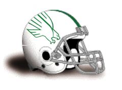 uh....no where do the wings end? a plain helmet would be better than more SOW.
 -
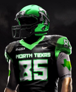
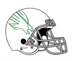
From the album: 3XL Mean Green
© 3XL Design
-
Those Uniforms Posted in the Gallery are Sweet!
3XL replied to Mean Green 93-98's topic in Mean Green Football
an OSU alumni sent me this...Mike Gundy's take on new uniforms http://www.orangepower.com/threads/nokblog-mike-gundy-on-osu%E2%80%99s-new-uniforms-%E2%80%98it%E2%80%99s-an-opportunity-for-us-to-be-different%E2%80%99.121998/ -
Those Uniforms Posted in the Gallery are Sweet!
3XL replied to Mean Green 93-98's topic in Mean Green Football
817Fan sent this video to me jus saying.... -
From the album: 3XL Mean Green
© 3XL Design
-
From the album: 3XL Mean Green
© 3XL Design
-
From the album: 3XL Mean Green
© 3XL Design
-
Those Uniforms Posted in the Gallery are Sweet!
3XL replied to Mean Green 93-98's topic in Mean Green Football
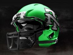
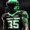
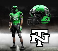
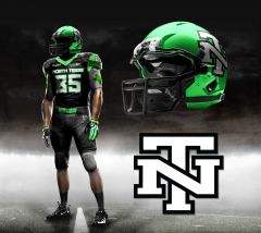
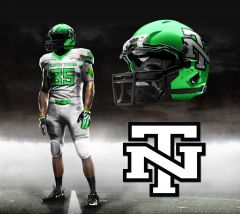
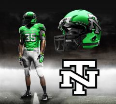
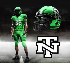
if we did a "true" traditional football uniform ala Alabama, Penn State but in green...that would be pretty cool! heck even "Texas Southern" had much cooler and traditional uni's than NT earlier in the season. Simply remove the "horn" stripes, shinny pants and North Texas from helmet. Helmet would be solid green and have one white stripe, with grey face mask. the newly proposed interlocked NT uni's would tie in both the 1) traditional (older demographic) with 2) new (younger generation & recruits) we need to "add" the interlocked NT to our exsisting official school marks and watch the merchandise sales increase. either way..."we need to change the football uniform paradigm" & think bigger! -
Those Uniforms Posted in the Gallery are Sweet!
3XL replied to Mean Green 93-98's topic in Mean Green Football
for better resolution images of the proposed football uniforms please click on this flickr link. http://www.flickr.co...N03/8215228472/ I have included two new home options. remember..."think North Carolina in green" for the marketing everything! no North Carolina baseball cap has UNC on it...it has...an interlocked NC. - where you see an interlocking NC replace with interlocking NT - where you see a tar heel logo or tar heel written out replace with a "mean green" logo, "eagle" logo or MEAN GREEN written out - where you see North Carolina written out replace with North Texas - where you see UNC written replace with UNT - where you see NC ram mascot replace with NT eagle we can still use/brand our special font or whatever throughout our jerseys, end zones you name it...just thought this one looked cool too! thanks 3XL -
From the album: 3XL Mean Green
© 3XL Design
-
From the album: 3XL Mean Green
© 3XL Design
-
Those Uniforms Posted in the Gallery are Sweet!
3XL replied to Mean Green 93-98's topic in Mean Green Football
click on these links for nice collegiate use of interlocking letters for school apparal and uniforms...why not? think "North Carolina" in green...maybe green on green. A bold, bigger, better mark...classic college look. forget the "black uni's" and "what shade of green" for a minute...that was for fun & style points. I love our green...."mean green" http://www.goheels.c...62&SPSID=667864 http://www.usctrojan...ootbl-body.html Question 1:Why would the University of North Texas need permission from the the Alumni Association for the letterman's interlocked NT? Simply use the "letterman's" interlocking NT without the star. Many schools use interlock letters...this is not new. It's a classic look. We already use it with our letterman's jackets. Question 2: Why would the Alumni Association ever deny "their" university of a mark that would help brand "their" school? They should work together to resolve and make this a "non' issue. This whole issue makes zero sense. -
Those Uniforms Posted in the Gallery are Sweet!
3XL replied to Mean Green 93-98's topic in Mean Green Football
I'm very glad to hear the positive comments on these "proposed" uniforms. My past is in advertising art and present is 15+ years in sales and marketing. ....in sales....I have learned..."if it looks better it will sell better"...in ad art I learned that sometimes "less is more". I have always disliked the North Texas spelled out on the helmet. Also, not a fan of the "horn" stripe of any kind on pants or jerseys. "Horn stripes" are not old school or new school...just a bad idea on a football uniform. I chose to go with no stripes on pants...ala Texas, TCU & the old A&M looks. Heck even Texas high schools are going away from the "horn stripe" on shinny pants look. I wanted to "plus" our current uniform look...or simply "make them better" Here is my thinking and catalyst for creating them. (with the photoshop help of my very talented nephew and his Master's Degree from S.C.A.D.) 1. We have new state of the art stadium...this thing is awesome! 2. We have a new great coach..."sunglasses & muscles" who does'nt love Mac 3. We are entering into C-USA next year...how cool is that ? 4. We need an updated look that both appeals to our fan base and the young recruits. "a little swagger for the team" Reason for the "Letterman's Jacket" interlocking NT 1. It's a classic collegiate look. (i.e. UNC or NC, Auburn, Notre Dame "ND", Texas Tech, Georgia Tech, Oklahoma, West Virginia, Kentucky, Virginia Tech, Baylor, Colorado, Houston, Indiana, USC or Southern California using interlocking SC on v-neck of jerseys) "we should not put UNT on everything. Texas does not put UT on a baseball hat. North Carolina does not put UNC on a baseball hat" 2. "If we want to be a little bigger...we need a bigger mark"...less of the UNT,FIU, FAU, WKU, UAB, UCF, ECU etc... 3. No other University has the interlocking NT 4. NT is perfectly balanced and symmetrical...makes a great brand or mark for: car emblems, jackets, hats, suit pins, cuff links, golf balls, cups, coozies, shirts, etc... 5. We used to have it on helmet back in the Mean Joe Green days. "it ties the old with the new" 6. the NT scale for helmet was inspired by Texas A&M's "T" ....really glad we're green and not maroon....can you imagine the "horror" of being saddled with worst color in college football? 7. there are lots of eagles flying around but no "NT" or "Mean Green" 8. think North Carolina in green 9. not a rebrand but our school needs to add the interlocked NT as an additional mark...this will increase mercandising sales. Reason for the "Green with Black Accents" 1. They look great together. 2. It's current and looks less 1970's and 1980's 3. NT already uses in our other sports and it's on our football field. Reason for Updated Green 1. We are the "Mean Green" right? why not brand a cool "mean green" color 2. It's a cross of our old "flying worm" apple green, kelly green and "Monster Energry Drink/Kawasaki" green 3. Really..anything less "dull" green will work...a little "wow" factor green...add a "Mean Green" pantone to our unt pantone 4. "Mean Green" words to be placed on front of helmet with the "nameplate" decal or back bottem helmet decal Reason for 3rd option or Special "Black Uniform" 1. Watching the Tuesday Oct 16th night NT game "in my hotel room in NC"....I was thinking how cool would it be to have a special "tv night game" or "rival' jersey. 2. Helps with recruiting. 3. I don't want us to always wear all black...that's not it at all....just for a "special" game. say...SMU? Reason for State of Texas stamp on the under shirt 1. Tastefully eliminates the need to "spell out" North Texas on the helmet. 2. Would need to keep it simple and green...no numbers, logos, words, no outlines I'm trying to get a green on white and green on green mock up done...we'll see? if so....I'll post. again...thanks for the positive comments! "go mean green" 3XL -