Jump to content

Those Uniforms Posted in the Gallery are Sweet!


Mean Green 93-98

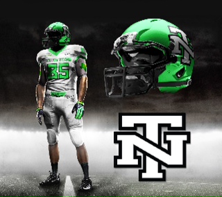
It may be a little redundant, and it may still be football season, but I felt those uniforms deserved a discussion thread.
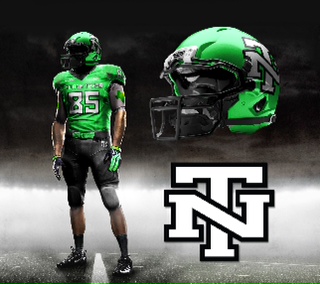
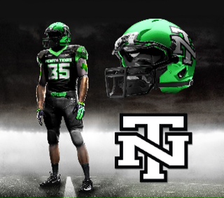
gallery_36865_92_27051.jpeg

gallery_36865_92_14382.jpeg

gallery_36865_92_5701.jpeg

Black football uniforms still leave a bad taste in my mouth . . . but if we were to use an alternate 3rd black uniforms, that would be the uniform I would want.

Awesome job, 817 Fan.


User Feedback

Recommended Comments


if we did a "true" traditional football uniform

ala Alabama, Penn State but in green...that would be great! heck even "Texas Southern" had much cooler traditional uni's than NT earlier in the season. Simply remove the "horn" stripes, shinny pants and North Texas from helmet. Helmet would be solid green and have one white stripe with grey face mask.

the newly proposed interlocked NT uni's would tie in both the

1) traditional (older demographic)

with

2) new (younger generation & recruits)

either way..."we need to change the football uniform paradigm" & think bigger!

Yes, that's it. To be big one needs to think big.

  • Upvote 1
  • Downvote 1
Link to comment
Share on other sites

The interlocking NT is a half step up. To fully get into our new brand, we would be wise to put the SOW on the helmet and pants with "Mean Green" on the shirts. UNT Mean Green.

We do not lose our small school "North Texas" roots; rather, we are stepping up with the big boys. Keeping "North Texas" or "NT" on our helmets will keep us branded as North Texas State. No bueno.

Edited by EagleGreen
  • Upvote 1
  • Downvote 1
Link to comment
Share on other sites

I really wish they would choose something like this and stick with it. I am sick and tired of new looks and rebranding. The interlocking NT is great. When I played we had the eagle on the side of the helmet. Awful...

If you think the players don't want something cool looking, exactly like the ones in this thread, then you are dead wrong. Our current uniforms are great but the helmet is unoriginal and boring. The helmet in this thread at perfect, simple, and unique. They should go for something like this and leave it. Just like all the other schools do. You don't see OU, UT, TT, A&M, TCU, SMU, Baylor, ect changing there logos every couple of years.

Great job. These uniforms are perfect. Especially the helmet. To bad I doubt they will change anything.

  • Upvote 3
Link to comment
Share on other sites

I love these uniforms.  The swooping Eagle is nice but were are better known as the Mean Green.  If we were to go away from the Eagle the interlocking NT is the way to go.   This went back to all the way 2012?  Wonder why this AD is no longer around.

  • Upvote 2
  • Downvote 1
Link to comment
Share on other sites

I don't mind our all white unis that much, they're actually my favorite, just behind our all black 2012 HoD Bowl uniforms and helmets. I just don't like our all green uniforms at all, especially the small font and numbers on them! Hopefully this new young coaching staff will have a say in getting new young and hip uniforms as well. Excited to see this new era of Mean Green football.

  • Upvote 1
Link to comment
Share on other sites

13 hours ago, Mike Jackson said:

I love these uniforms.  The swooping Eagle is nice but were are better known as the Mean Green.  If we were to go away from the Eagle the interlocking NT is the way to go.   This went back to all the way 2012?  Wonder why this AD is no longer around.

for us...the interlocked NT would be a more collegiate look for sports & spirit branding...think A&M, Tech, Auburn, WV, VT, OU & "North Carolina" in Mean Green and less USAA insurance, postal service & U of Phoenix on-line...

  • Upvote 2
  • Downvote 5
Link to comment
Share on other sites

3 minutes ago, 3XL said:

for us...the interlocked NT would be a more collegiate look for sports & spirit branding...think A&M, Tech, Auburn, WV, VT, OU & "North Carolina" in Mean Green and less USAA insurance, postal service & U of Phoenix on-line...

As a counter-argument, you've got UT, FSU, Michigan State, Boise State,...Iowa...

I like the diving eagle, but it would be cool to see what a modern interlocking NT would look like, if not a throwback.

  • Upvote 2
Link to comment
Share on other sites

Just now, Aldo said:

As a counter-argument, you've got UT, FSU, Michigan State, Boise State,...Iowa...

I like the diving eagle, but it would be cool to see what a modern interlocking NT would look like, if not a throwback.

agree...but majority of P5 schools use  letters to brand & market their sports & spirit gear...Michigan, Wisconsin, Norte Dame, Kentucky, Minnesota, Ohio State, Nebraska, Virginia,  Georgia Tech, Georgia, Baylor, Purdue, Tennessee,  Ole Miss, Miss State, Arizona, Syracuse & Alabama 

"letters are better" unless you're getting an on-line degree, delivering the mail or selling big-co insurance

  • Upvote 2
  • Downvote 4
Link to comment
Share on other sites

1 hour ago, GrayEagle said:

I wonder how the interlocked NT would look with a small SOW diving across the middle where the seal is on the alumni association font.


Probably a little too busy for a football helmet.  It needs to be one or the other.

SOW on the helmet with this uniform would still look pretty sharp, IMO.

Link to comment
Share on other sites

Though not necessarily on the helmet, I'd like to see us incorporate more of our Texas heritage. I like the Texas star with the interlocking NT.  I'd also like to see an outline, or a solid green, state of Texas with the SOW inside of it or superimposed on it. Anyone good at clip art?

Link to comment
Share on other sites

29 minutes ago, Hunter Green said:

Though not necessarily on the helmet, I'd like to see us incorporate more of our Texas heritage. I like the Texas star with the interlocking NT.  I'd also like to see an outline, or a solid green, state of Texas with the SOW inside of it or superimposed on it. Anyone good at clip art?

We need to at least come in line with Texas helmet protocol and have the state outline and star to mark Denton's location within on the helmet's backing.

  • Upvote 1
  • Downvote 2
Link to comment
Share on other sites


Join the conversation

You can post now and register later. If you have an account, sign in now to post with your account.
Note: Your post will require moderator approval before it will be visible.

Guest
Add a comment...

×   Pasted as rich text.   Paste as plain text instead

  Only 75 emoji are allowed.

×   Your link has been automatically embedded.   Display as a link instead

×   Your previous content has been restored.   Clear editor

×   You cannot paste images directly. Upload or insert images from URL.


×
×
  • Create New...

Important Information

We have placed cookies on your device to help make this website better. You can adjust your cookie settings, otherwise we'll assume you're okay to continue. Please review our full Privacy Policy before using our site.